
Part A: Research
Investigating and researching into the field of editorial illustration
Ideas and Concepts
Examples of editorial magazines that have interesting themes and ideas.
Tribune
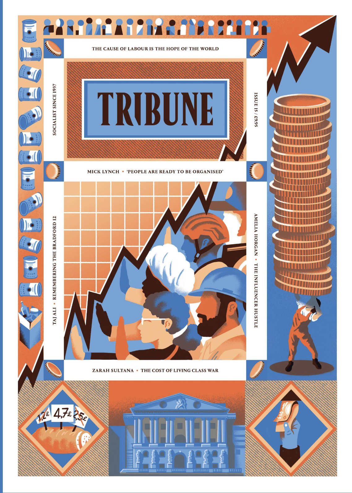


The Tribune features many illustrators on its coveres and within its pages. This magazine is very firmly in the left of out political spectrum, and highlights issues that are arising as right wing ideoligies gather more momentum across the globe. Magazines like these help to keep the general population within the loop of how they can help and don’t brush issues under the rug. Although being confronted with how our societies are failing is scary in some regards, I find it vital that we remain aware of our situation and refuse to have the wool pulled over out eyes, and magazines like the Tribune help with that.
Positive News


Positive News keeps its general tone light, with bright and engaging illustrations, but not whilst caving to fluffy subject matter. With articles spanning from the right to repair to nurturing empathy in times of uncertaincy, Positive News has a well… positive tone. Addressing the flaws and issues in our societies whilst saying- no, it’s not the end of the world, we’ve just got to get off our arses and do something about it. In a world surrounded by doomscrolling and competitions between news outlets to have the most horrid and attention grabing headline that they can, Positive News is a breath of fresh air, whilst still remaining informative and wonderfully illustrative.
Image Making
Magazines, zines and illustrators that use processes of making that peak my interest.
Grown! By Sha’an d’Anthes


This independent zine looks into a forest and the creatures that live there- but what I’m interested in is the way this was printed, using risograph. Commonly described as digital screenprinting, RISO allows for a small range of initial colours to be overlayed to create many more. I love the texture and depth this brings to the illustrations- whilst still remainly mostly flat looking.
Simon Prades

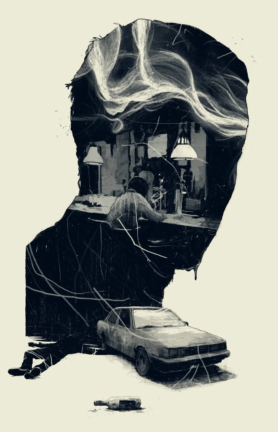
Simon Prades crosses traditional with digital, keeping the wonderful texture of graphite and ink lines, and injecting the colour and smoothness of a digital paintbrush. This crossing of mediums creates an output at is very unque and unlike much else. The texture is esspecially appealing to me- and some of the pieces of Prades’s works feels like it could feeature in a comic or somesuch. It’s clear and impactful, whilst still allowing a viewer to drink up the process in which it was made.
Design
Editorials that have impactful and engaging layouts and designs.
Stories Collective


Stories Collective is a fashion magazine that celebrates all members of the image making process, allowing their content to shine of their pages. The limited colour palettes, strong but sparse text and elements of graphic design strike me, and make me think that if I did own this magazine, it would be an active and positive influence on my space. The thing that I like most it that it just lets you, roominate, on the photography. Lets you explore it at your own pace, not shoving text in your face for 95% of the page.
Show Yourself by Daniel Haire

Show Yourself by Daniel Haire allows its focus of the article, to dictate its layout. I love the different illustrations and limited colour pallet that allow for the text to weave in and out of the illustrations, instead of forcing the text to move around it like this page from VEGAS magazine, illustrated by Kali Ciesemier.

Many, many editoral illustration pages have the layout of lovely illustration:dense text. Instead of incorperating the two elements together, allowing them to flow freely supporting eachother, they clash. The text, tiny and compact disrupting the flow and balance of the layout. Thats why I love Daniel Haire’s work so much.
Topics
Publications I find personally interesting, even if they are not as illustrative.
International Designers Network Volume 26 No.4


The only smaller magazine company that I have seen featuring a game art issue, I was very excited to see this in Magalleria. This magazine features a wonderful range of game art, from UI design for Mass Effect, card game designs to the personal concept art of game artists, it really sparked my interest. I think the thing that draws me to game art is its immersive-ness. It’s a way of experiancing a piece of art that no other medium or type can replicate.
International Designers Network Volume 24 No.3


Another issue from IDN, this time looking at comics and their design. Mainly a showcase of many different artists and their comics, I picked this issue up as I have always been interested in the concept of making a comic, but have really looked into it futher other than “huh, that would be cool to do”. This magazine gives a new sense of understanding to the format for me, a source I’ll use for inspiration either in this project, depending on what I want my responce to be, or for a furure project.
Magalleria


Magalleria is a wonderful little shop in Bath- and out of all of the places I looked at for magazines, was the place I felt the artistic community was best represented. With so much content packed into such a lovely space, it was very hard not to pick up all of the magazines I saw, but I did end up choosing five, with the intent of picking up issues that I wouldn’t of looked at more than once unless it was infront of me.
Hellebore


A small magazine exploring British occults, myths and folklore, there were various issures I could of chosen- but I went with Issue No. 5, Unearthing. Multiple aspects drew me into the magazine, I love its A5 size, and the ratio of imagry to text, allowing both to shine in their own areas, as well coming together in other spreads of the magazine. The half tones and limited colour palette create a wonderfully striking experience, adding to the individual personality of the magazine.
Farsight Futures Reviewed


Im not one for consuming too much politics, I keep myself in the loop but other than that I find the subjects to bog me down, but in the case of Farsight, I just had to have this magazine, simply for its infographics and type. Incredibly striking even on a brief flip-through, Farsight tackles various geopoliticle topics, from China’s Great Firewall to global supplychain issues, its insights are punctuated with simplistic but compelling illustrations and title pages.
Counterpoint


Hand bound and risograph printed in Scotland, Counterpoint in this issue tackles the issue of failure and how it affects different artists and their processes. I couldn’t help but beam when I picked this magazine up. The visuals are simply sublime! It was so wonderful to finally pick up a magazine and feel the artistic vision seep from image to text, both working in tandem to make a wonderful experiance. The colours are gorgeous, the layout gives space for you to think for yourself and although I’m not a large fan of the styles of the illustrations in the issue, I do like the pixle art page.

Part A 250 Words: Image and Text
Editorial illustration is not a topic/area of illustration I've looked into much- but I didn't exactly have a fond opinion of it at the beginning of my research. At first it was a simple distaste of the illustrations that appeared in common editorials. They felt so lifeless, and although I know why certain trends, like the simple bold text forming images or the double meaning illustrations are persistent, as they are simply good at visualising a text's meaning/message, I didn't, and still don't like that particular corner of editorial illustration.


So, I took a more generalised look at editorial illustration to challenge my preconceived notions. Looking for examples of editorials that allow the illustration to take up a larger role in the article/experience for the viewer. I also tried to not just pander to my personal interests, and took a look at examples that I would not think to illustrate myself, such as political or environmental issues. This approach allowed me to gain a greater understanding of the way illustrations are used all over the editorial field as a whole.


Despite finding a large range of editorials featuring illustrations pertaining to topics I initially wouldn’t have researched, I couldn’t find an example of an illustrated editorial that focused on a little niche of mine, the connection between illustration and game art. The closest I got was IDN Volume 26 No. 4. However I did find a wonderful range of image making techniques through my research. Such as risograph printing and the combination of digital and traditional mediums.


Although I don’t feel as if my stance of not particularly wanting to do editorial illustration as a career in the future has changed, this research stage has certainly enlightened me on the scope and variety that the field holds. I'm still a little confused as to what the second half of this project actually is, but I think I’ll be going into it with the concept of creating a response that bridges the illustration-game art editorial gap, however that may be.

Part B: Magazine Develoment
Magazine development
Generalised Research
Including the first stages of idea generation and the classwork that accompanies it. (the stuff i did before locking down an article basically)


Article and Idea Development
In the end I have chosen this article to base my project off of:
https://www.theverge.com/2018/11/11/18076272/league-of-legends-virtual-k-pop-new-audience
In essence the article covers how the bigwigs at Riot Games ended up atrracting a whole accidental audience through making really good extra content for their game, League of Legends. But the article doesn’t go into a whole lot of detail- and I got inspired to create something in the same vain- but a little bigger in scope.


The Magazine


Development
First I’m starting of with creating a few of the repeating backgrounds to get the ball rolling- before moving into the spot illustrations/full page illustrations.
Keeping to dark blues and soft golds to help text pop when I add it later, all of these backgrounds were drawn in CSP, a program I find a little easier to use than Photoshop.


All of these backgrounds include the core shapes that appear throughout the League of Legends content catalog, squares/rectangles, diamonds and triangles. Circles are also used in the LoL design- but to bring focus to aspects of content. But seeing as these are backgrounds, I didn’t see it fit to use them for these.
Gradually I’m making my way through pages- and because indesign is breaking my brain a little bit, I am formatting the text and boarder aspects in Procreate and then Placing them in Indesign. Certainly a bit of a roundabout method, but for some reason it works for my strange little brain so I’m doing it- sue me.

For the mainly text / text+ spot illustration pages the design flow mostly follows creating the text, formatting onto the pages (with illus if nessercary), then making funky little league style boarders. Im doing the document at 600dpi A4 and that means I only have 11 layers avalible. Certainly annoying, but it just means I need to be sure about my text and layout before combining the layers and moving onto the next aspects of the design.


For the second how to play page, it has some more complicated illustrations, so I screen-shot the process, following the same process as the other pages, then moving on.

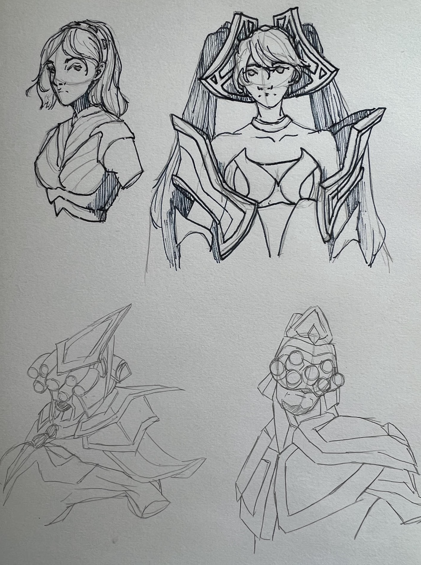


First I organised the text and then sketched out some studies, using the League in game models/seperate model photography to practice their design. The rest of the screenshots follow my drawing of Lux so you can se how I built up all of the portraits featured in the champion recommendations.
Timing and Schedualling
So. This be chonky. The how to play 2nd page took this time to format and draw boarders.

Not to mention the three portraits…

7 hours 48 minuets for one page
*cries in my obsession for perfection*
Ive got 24 pages, 3 are fully completed soooooooooo 8 hours (cause the other pages will fluctuate in complexity) x 21 = 168 hours
It is currently the 7th Jan for me, and there is a 4 day turnaround for printing a binding so 13 days.
I’d need to work 12 hours every day to complete this on time.
Ok so I think I would actually fall out of a first story window if I did that so imma do as much as I can, maybe do a mini print featuring some of my pages and have the whole thing in whatever state of finish it is on the 24th in a fourth blog post after this one.
Front and Back
Ah to the task I’ve been procrastinating. I figured I HAVE to get the front and back done to ensure even if it isn’t finished on the inside when I print it, it will look atleast somewhat presentable. So first:
The Title.
Is cringe. I am horrific at comming up with names so I thought of a few and came up with a wider list to wittle down.
Dev Dot.
Dev Dive
Deep Dive
Content Cave
Data Dive
Game Frame
As you can see, I rely on alliteration alot. I ask a couple of people of what they thought would work best. I ruled Dev and Data out cause it implies something a bit more technical than what I want. Eventually I settled on:
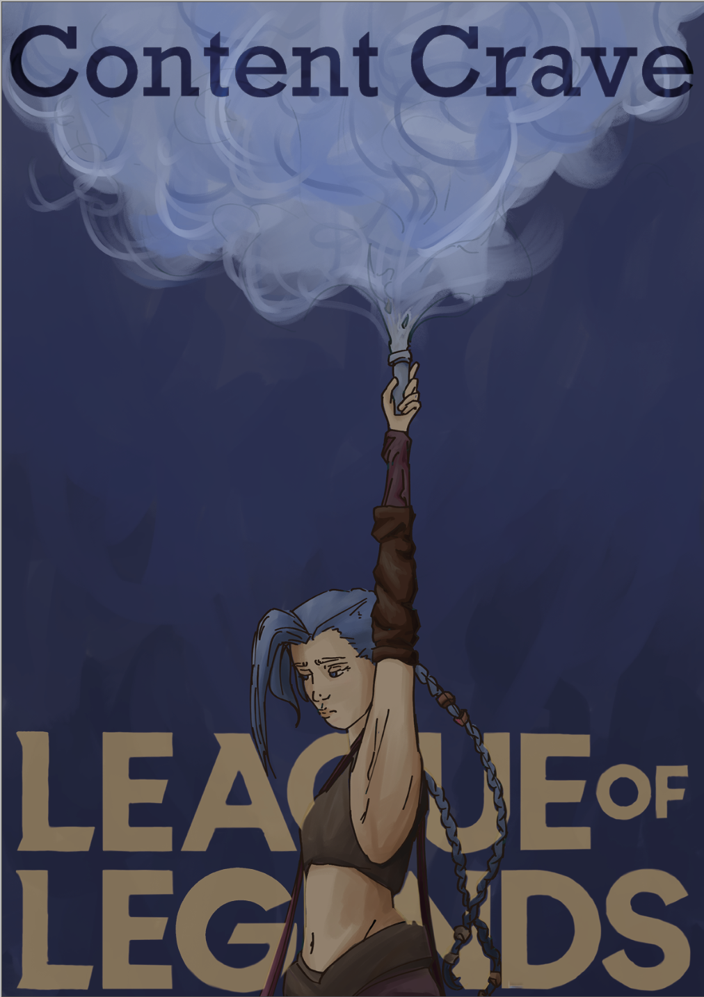
Content Crave
For me it works it is for the people who crave content- a magazine which compiles and presents all related media that might be initially a little scattered across various platforms.
Cover and Back

Cover Thumbnails
At first I was planning that whatever design fell second in my ranking of most liked, I would use as a back cover illustration but I had An Idea. I’ll create the back cover as a tease/revel of the next ‘issue’ of Content Crave- based on Nier. Or Voltron Legendary Defender. Both have hella history that would be fun as hell to draw. If I have a full day after making the front cover I’ll do Nier, if not I’ll do Voltron, because they fluctuate in difficulty in how much I have drawn them and therefore my speed differs.
Cover Design
Ill be combining thumbnails 1 and 4. I’m pretty set on the jinx flare imagry as it managed to get onto Reddits 2022 r/place pixle artwork. Cementing it as one of the most recognisable bits of League imagry.

No, Jinx is not french, however the studio that made Arcane, Fortiche, is!
Cover Process


To speed up the process, I ripped the Jinx pose from a personal sketchbook page of mine, dedicated to Arcane.

Getting the pose correct involved going frame by frame through the original scene and filling in the gaps with my own hand referance material due to shot composition having some elements remain out of frame.
Finished Cover
Back Cover
IM DOING NIER BAYBEH
I’ve drawn the Neir characters alot over the last couple years in various sketchbooks, so I’m going to compile those into a star wars-ish portrait showcase back cover thingie mcbop. I’d do something more complicated with thumbnails and storf like the cover but I have 24 hours = not enough time. Also Nier is a franchise that had one character, 2B, go mental with populatity and pop up everywhere while the other characters and elements fall a little bit to the wayside so she is a nessecary element to include, as well as appealing to a large ‘audience’.

![Fio - Nier:Re[in]carnation](https://images.squarespace-cdn.com/content/v1/630e26eb16b91c41c5d6c28f/1673780885065-1HWL27IYBVRERA9KVR5G/Screenshot+2023-01-15+at+11.05.33.png)
![Hina - Nier:Re[in]carnation](https://images.squarespace-cdn.com/content/v1/630e26eb16b91c41c5d6c28f/1673780892224-38EH0W8VX0XSXNPT9N75/Screenshot+2023-01-15+at+11.05.46.png)
![Fio - Nier:Re[in]carnation](https://images.squarespace-cdn.com/content/v1/630e26eb16b91c41c5d6c28f/1673780897986-1IN0YAT649Z07QOPZ7P2/Screenshot+2023-01-15+at+11.05.59.png)
![Fio - Nier:Re[in]carnation](https://images.squarespace-cdn.com/content/v1/630e26eb16b91c41c5d6c28f/1673780905656-8OREJJGIQTY1XJ33GHE8/Screenshot+2023-01-15+at+11.06.17.png)


These four illustrations I have done specifically for the back cover- I’ll be popping them into clip studio paint to draww over and then colour.
Back Process


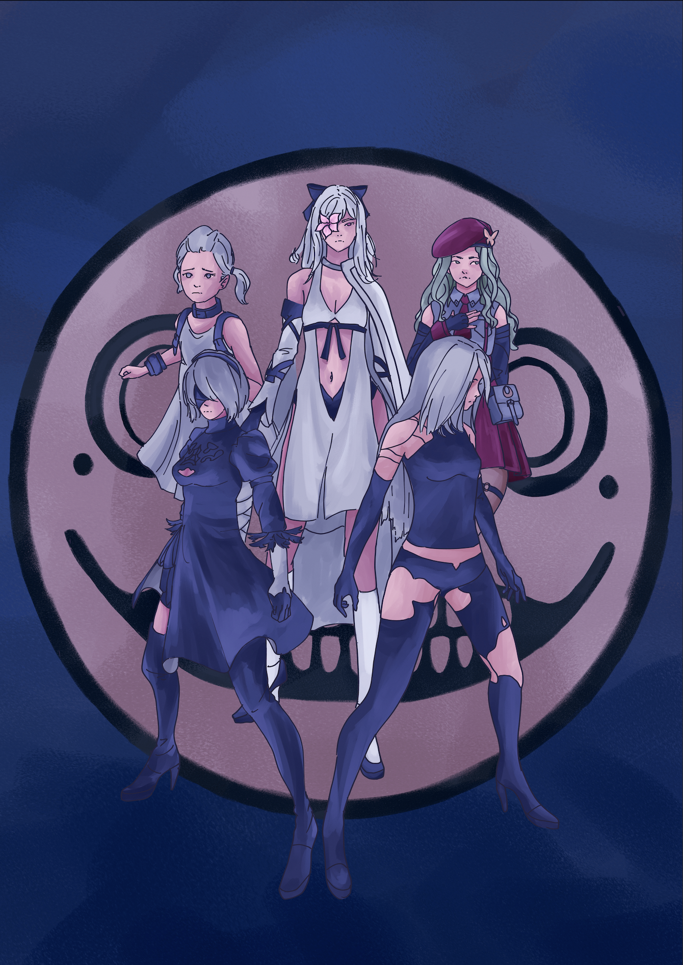


I did not mean to make it so purple. IT WAS MEANT TO BE BLUE TONED. The calibration on my drawing tablet is just forever trying to destroy me so I had to use photoshop and procreate to get it into a better state once I realised.
Finished Back Cover

Illustration Processes
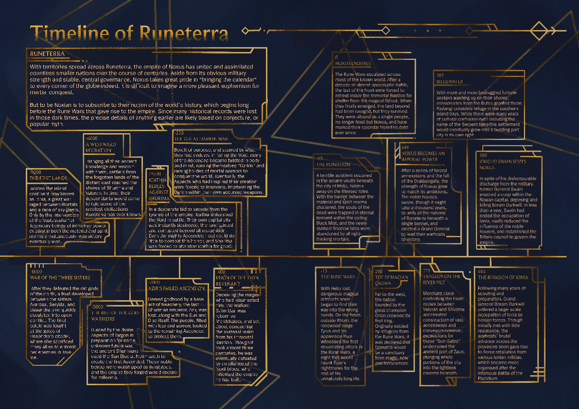
Runeterra Map


Ahri Character Spotlight


Running Out of Time
Unfortunatly, I haven’t been able to finish the magazine in time for the deadline. For some pages I have been able to roughly draw over the sketches and pop those in place to signify what would be there, but for others I have had to leave the spaces blank as I simply don’t have the content drawn. Due to this- as well as the cost I decided not to make a physical copy of Content Crave either. I was becoming overwhelmed and needed to step back- regrettably making me miss the print deadline, but at the time I needed to prioritise my metal & physical health.
Improvements and Reflections
There are many elements of the magazine that I could improve on, content:illustration ratio is probably the element I would most like to reshift within the magazine, as well as making different sections have more distingishable shape/design language. There are a miriad of other examples but for a first attempt at a publication with so many pages, when I have only ever made purely imaged based zines beforehand, I think I’ve done pretty well.
Additional notes:
I like the gradient gold titles I implimented in the htp pages, so I’ll need to go back and apply those to the Introduction and Riot Games pages.
Text Sizing/Type:
Titles: Beaufort | Content: Spiegel
Main Page title - Whatever the hell fits/looks good lmao
Introductory title:paragraph - 12:12
Main Content title:paragraph - 12:10
Now I’ve just noticed that the Controversies title on the Riot Games page is the wrong colour. Guess I’ll go change that to.
Colour Guide! (in hexadecimal)
Text Titles: #dc9c38
Text Substance: #f5c78e
Boarders & Page Titles: #c7a96e #c89a3b #775927 #453614 #e7980a
Research
Due to League being such a big game, there is lots of information about it- but it’s scattereed in little niques that ill need to sniff out and compile for the magazine
Intended for bug reports and player feedback, the support forums have a surprisingly good amount of information that is detailed, accurate and from what I can see, pretty reliable aswell.
The League of Legends official site is extremely useful aswell- information is abound, and they are oddly welcoming of giving tips to anyone who wants to make League styled content- resources I only found through my recent research.
Also I’m looking at streams and content creators to help get an idea as to what to write for the community content sections- which I am also collapsing down from 4 to 2 pages due to not toooo much quality content to fit into the mag.
Below are a couple screenies from Magikarpusedflys youtube channel, and a lolTyler1 stream (all hail the head dent himbo). Unfortunatly Tylers’ setup kinda blocks the UI, so I couldn’t use it for the UI breakdown in the How to Play spread. Big Sadge.


Link Dump
Links I’m saving so that having 20 chrome tabs open doesn’t murder my computer:
League Fundamentals : https://brand.riotgames.com/en-us/league-of-legends/fundamentals/
Support Forums (in-game events): https://support-leagueoflegends.riotgames.com/hc/en-us/articles/4415086433427-League-of-Legends-Lunar-Revel-2022
Jinx illu community example: https://www.reddit.com/r/arcane/comments/qywpvf/no_spoilers_i_loved_this_scene_so_i_created_an/
arcane illu community example: https://www.reddit.com/r/arcane/comments/uynv9u/no_spoilers_first_date_pixel_art_by_me/
cosplay k/da community example: https://www.instagram.com/rinnieriotcosplay/?hl=en
k/da illus community examples: https://www.artstation.com/artwork/balDyk

Part B: Content Crave: League of Legends
Content Crave Magazine and 250 word evaluation


Evaluation
For part A of this project, I believe that I have researched and developed my understanding of the field of editorial illustration to an acceptable degree. I have looked into large and small publications, spanning a range of topics to learn how illustration can be used to enhance and emphasise talking points- as well as bring new understandings to certain topics.
For part B, I bit off a little more than I could chew. My response to the article I chose was in essence, “This is a cool showcase of League fan content and all, but it can be done better.” While this was what I needed at the time, a clear and decisive direction that I could take my project in, I don’t think it fully challenged me to make an illustrative editorial. As it eventually morphed into me making a League of Legends magazine with illustrative elements rather than what I found appealing in my part A research, illustrations with editorial elements. Despite this, I am proud of my work. The magazine, although unfinished, introduced me to topics and helped me develop multi-page narratives, the idea of taking the viewer on a clear journey, page design and formatting and how to emulate design languages.
All in all, this project has been successful in introducing me to editorial illustration and while my own attempt was flawed and overly ambitious, it still allowed me to explore and develop various design and illustration skills. Moving forward I need to keep in mind my own limits with how much content I can create, and ensure to lock down a concrete idea/goal for my project, and not allow myself to get lost in the unnecessary content elements.