Part A: Research
Ideas and Concepts
Examples of editorial magazines that have interesting themes and ideas.
Tribune
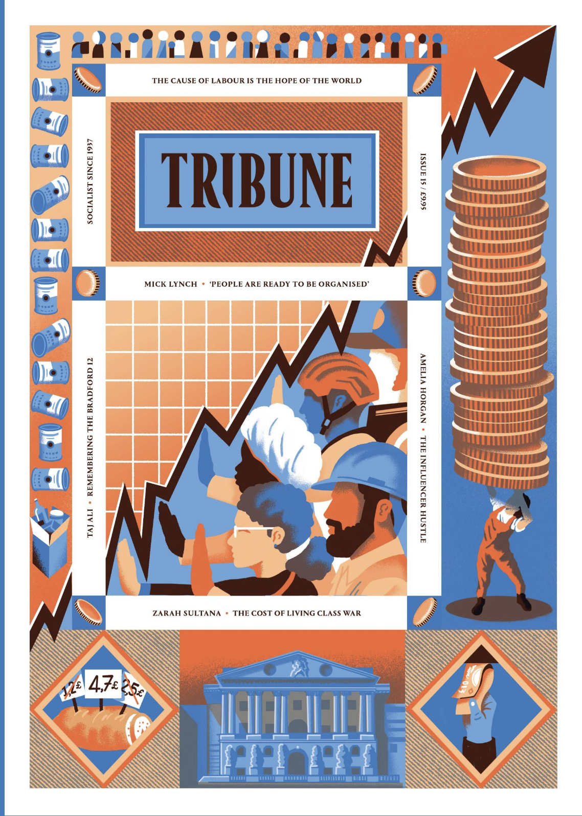


The Tribune features many illustrators on its coveres and within its pages. This magazine is very firmly in the left of out political spectrum, and highlights issues that are arising as right wing ideoligies gather more momentum across the globe. Magazines like these help to keep the general population within the loop of how they can help and don’t brush issues under the rug. Although being confronted with how our societies are failing is scary in some regards, I find it vital that we remain aware of our situation and refuse to have the wool pulled over out eyes, and magazines like the Tribune help with that.
Positive News


Positive News keeps its general tone light, with bright and engaging illustrations, but not whilst caving to fluffy subject matter. With articles spanning from the right to repair to nurturing empathy in times of uncertaincy, Positive News has a well… positive tone. Addressing the flaws and issues in our societies whilst saying- no, it’s not the end of the world, we’ve just got to get off our arses and do something about it. In a world surrounded by doomscrolling and competitions between news outlets to have the most horrid and attention grabing headline that they can, Positive News is a breath of fresh air, whilst still remaining informative and wonderfully illustrative.
Image Making
Magazines, zines and illustrators that use processes of making that peak my interest.
Grown! By Sha’an d’Anthes


This independent zine looks into a forest and the creatures that live there- but what I’m interested in is the way this was printed, using risograph. Commonly described as digital screenprinting, RISO allows for a small range of initial colours to be overlayed to create many more. I love the texture and depth this brings to the illustrations- whilst still remainly mostly flat looking.
Simon Prades

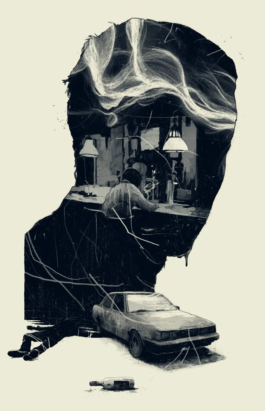
Simon Prades crosses traditional with digital, keeping the wonderful texture of graphite and ink lines, and injecting the colour and smoothness of a digital paintbrush. This crossing of mediums creates an output at is very unque and unlike much else. The texture is esspecially appealing to me- and some of the pieces of Prades’s works feels like it could feeature in a comic or somesuch. It’s clear and impactful, whilst still allowing a viewer to drink up the process in which it was made.
Design
Editorials that have impactful and engaging layouts and designs.
Stories Collective


Stories Collective is a fashion magazine that celebrates all members of the image making process, allowing their content to shine of their pages. The limited colour palettes, strong but sparse text and elements of graphic design strike me, and make me think that if I did own this magazine, it would be an active and positive influence on my space. The thing that I like most it that it just lets you, roominate, on the photography. Lets you explore it at your own pace, not shoving text in your face for 95% of the page.
Show Yourself by Daniel Haire

Show Yourself by Daniel Haire allows its focus of the article, to dictate its layout. I love the different illustrations and limited colour pallet that allow for the text to weave in and out of the illustrations, instead of forcing the text to move around it like this page from VEGAS magazine, illustrated by Kali Ciesemier.

Many, many editoral illustration pages have the layout of lovely illustration:dense text. Instead of incorperating the two elements together, allowing them to flow freely supporting eachother, they clash. The text, tiny and compact disrupting the flow and balance of the layout. Thats why I love Daniel Haire’s work so much.
Topics
Publications I find personally interesting, even if they are not as illustrative.
International Designers Network Volume 26 No.4


The only smaller magazine company that I have seen featuring a game art issue, I was very excited to see this in Magalleria. This magazine features a wonderful range of game art, from UI design for Mass Effect, card game designs to the personal concept art of game artists, it really sparked my interest. I think the thing that draws me to game art is its immersive-ness. It’s a way of experiancing a piece of art that no other medium or type can replicate.
International Designers Network Volume 24 No.3


Another issue from IDN, this time looking at comics and their design. Mainly a showcase of many different artists and their comics, I picked this issue up as I have always been interested in the concept of making a comic, but have really looked into it futher other than “huh, that would be cool to do”. This magazine gives a new sense of understanding to the format for me, a source I’ll use for inspiration either in this project, depending on what I want my responce to be, or for a furure project.
Magalleria


Magalleria is a wonderful little shop in Bath- and out of all of the places I looked at for magazines, was the place I felt the artistic community was best represented. With so much content packed into such a lovely space, it was very hard not to pick up all of the magazines I saw, but I did end up choosing five, with the intent of picking up issues that I wouldn’t of looked at more than once unless it was infront of me.
Hellebore


A small magazine exploring British occults, myths and folklore, there were various issures I could of chosen- but I went with Issue No. 5, Unearthing. Multiple aspects drew me into the magazine, I love its A5 size, and the ratio of imagry to text, allowing both to shine in their own areas, as well coming together in other spreads of the magazine. The half tones and limited colour palette create a wonderfully striking experience, adding to the individual personality of the magazine.
Farsight Futures Reviewed


Im not one for consuming too much politics, I keep myself in the loop but other than that I find the subjects to bog me down, but in the case of Farsight, I just had to have this magazine, simply for its infographics and type. Incredibly striking even on a brief flip-through, Farsight tackles various geopoliticle topics, from China’s Great Firewall to global supplychain issues, its insights are punctuated with simplistic but compelling illustrations and title pages.
Counterpoint


Hand bound and risograph printed in Scotland, Counterpoint in this issue tackles the issue of failure and how it affects different artists and their processes. I couldn’t help but beam when I picked this magazine up. The visuals are simply sublime! It was so wonderful to finally pick up a magazine and feel the artistic vision seep from image to text, both working in tandem to make a wonderful experiance. The colours are gorgeous, the layout gives space for you to think for yourself and although I’m not a large fan of the styles of the illustrations in the issue, I do like the pixle art page.