Main Project Work
Launch & Talks


Ideas & Artists
I’m completely new to the idea of visual essays/reportage/documentary drawing with an actual conscious theme behind it. I’ve occasionally drawn people in cafes, and that’s about it. Seeing as I’m so new to it all, I think it’s good for me to look outwards and see what other people are doing in their fields to get an idea of what is out there already/gimmie some ideas.

Paul Davis - overheard conversations/
people being… people-y.
I like Davis’s work because it kinda brings forth those conversations/comments that we don’t put much thought into, but say anyway. Also this kind of, voyeuristic sense to it, looking into people who haven’t exactly invited you in is an interesting concept to me.
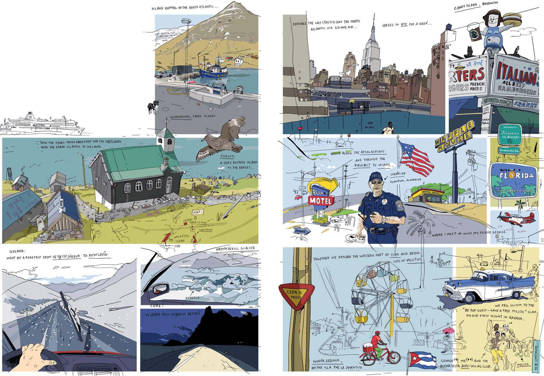
Oliver Kugler - Shetlands -> Cuba
A Travel Journal.
This relaxed and more informal kinda experiance documenting is just, really cool im my opinion. I like the lack of focus on facts and stats, more a recording of the experiance and vibe/ the area and how Kugler explored it, these little relaxed windows into different peoples thinking is something I love :D
Chloe Regan - The Set.
The subject for this piece of work not only intrigues me, the documentation of individual spaces important to an individual, and how they interact with them, but also the use of coloured pencils and the amount of life it brings to these observations/the overall commentry. I also find it interesting the mentioning in the projects description that they were inspired by a german philosopher’s work, Walter Benjamin’s ‘Arcades Project’.
Continuing Getting Lost…
At this point, I had completed the Mini Briefs and decided to shift from my proposals plan of how I would continue the project, and instead look into recording people at more flea markets.


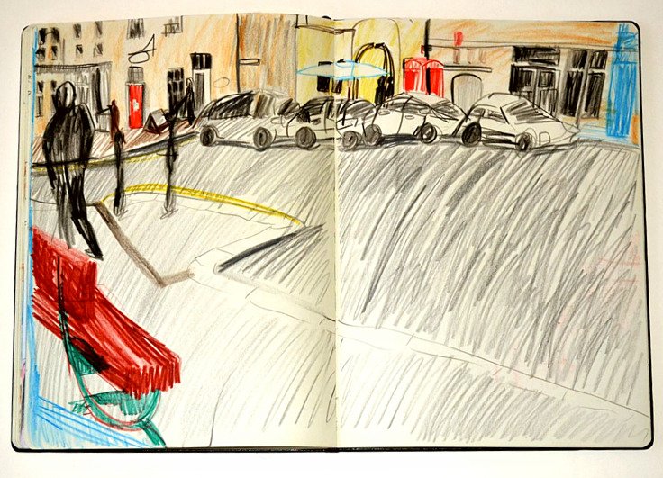
I used my skating recording sessions to experiment with colour and adding texture whilst I waited for the markets to begin. Then I visited Standerwick Flea Market, a weekly event held every Sunday.


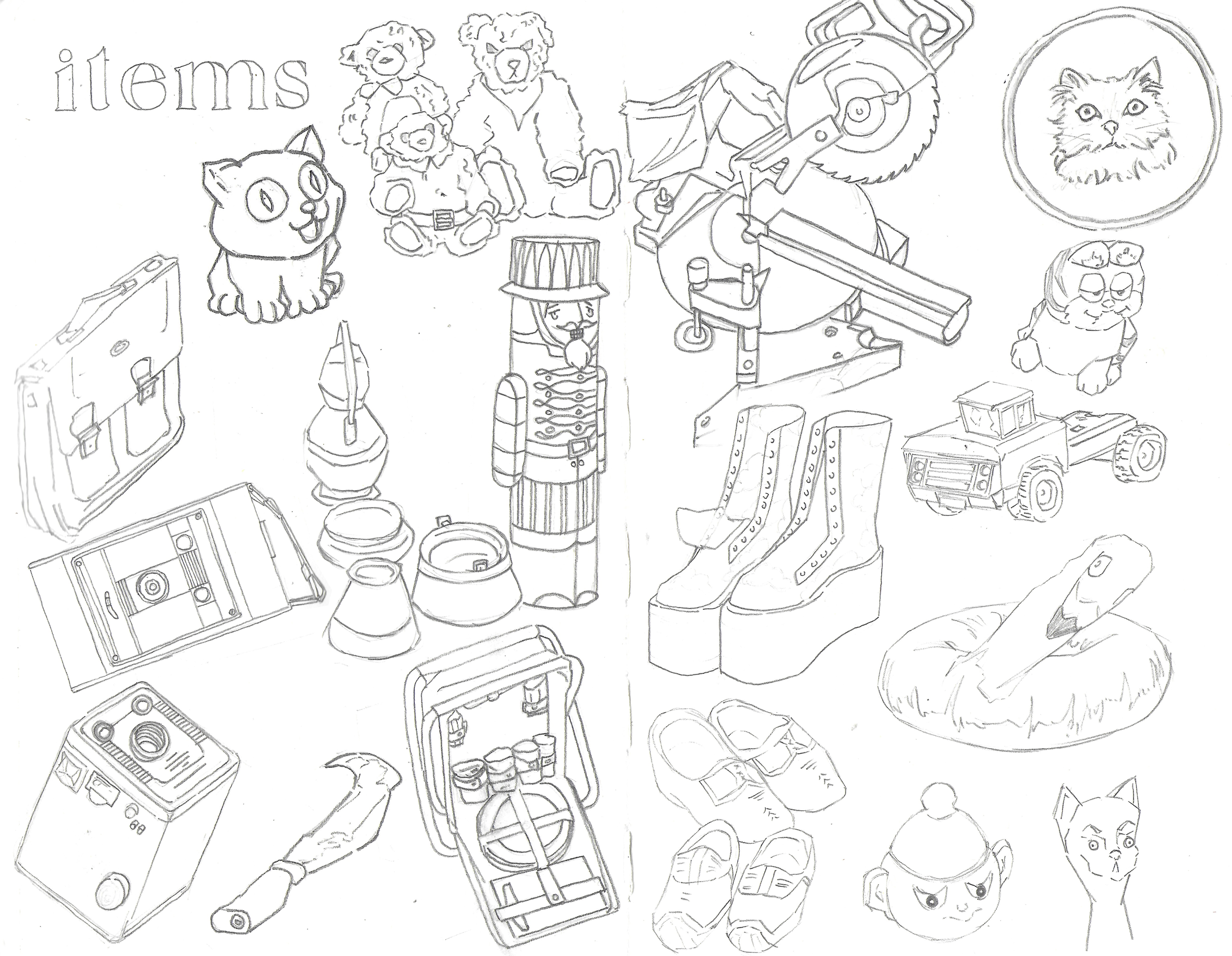
annoyingly the scanner butchers some of the sketches, seeing as I sketch very lightly- but im sure you can get the impression. at first after visiting the market, I just started to draw the people and things like I had done with shepton mallet.
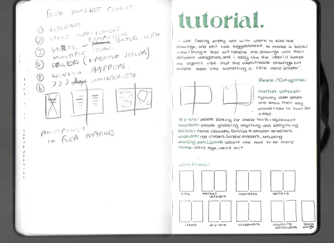
I was given some direction at a tutorial about where I could take my drawings, as I felt a little lost with what to do with them.


I drew out the page layouts and ommited the things I had already drawn in the initial standerwick pages, roughing out the shapes so I knew how closely I could draw other object around them. I also got rid of the diy-ers pages as it screwed with the page count as I forgot to add in the title back page and contents page into consideration. After drawing out the pages, I meshed the various drawings together to complete the pages.
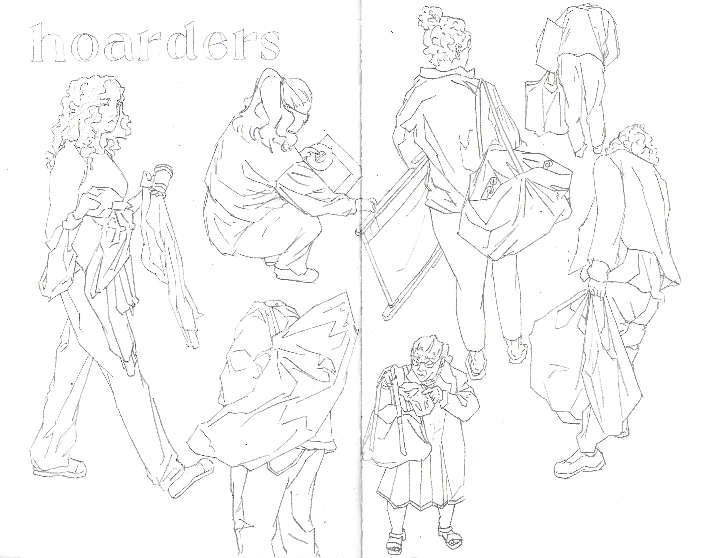


I added colour through photoshop, lessening the opacity to allow the sketch lines through, keeping the rough and more organic feel.


The title page, statement and contents were all created digitally.


While I like the overall design, looking back I wish I had copied these designs tradionally into my sketchbook so that they fit more into the rough feel of the other pages. I decided to go with the nature observer/documenter for the statement, a mock national geographic to fit in with the disheaveled wild west feeling that flea markets have.
The back page ended up being photos I had taken from Shepton Mallet, keeping with the observational theme whilst detatching the viewer and rounding off the experiance.