
Explore
Aim: To explore spaces and practitioner strategies for exhibiting.
You will use both primary and secondary research to evaluate practitioners that exhibit and spaces for exhibiting. To use primary research, you must have visited at least one of your selected exhibition spaces and / or interviewed an exhibitor. The remaining spaces or exhibitors can be sourced online but one of them must be international. The exhibiting spaces could be a conventional gallery, museum, public space or popup shop for example. Your evaluation should be a descriptive and factual report (with imagery) in the form of a blog entry
THE WILSON - Cheltenham Art Gallery & Museum
The Wilson Art Gallery & Museum is located within Gloucestershire and promotes artworks and artefacts relating to the area. The museum itself has four floors, consisting of a cafe, several galleries and a space for artist studios, that unfortunateley was not open to the public. All of the work on display has a connection to either Cheltenham or the area of Gloucestershire as a whole.
Currently The Wilson is showcasing three exhibitions. 1: Edward Wilson, his expeditions to the Antarctic and the various equipment, clothing and artworks that were taken/created during his trips. 2: The Arts and Crafts pieces that were created in Gloucestershire during the movement. 3: in partnership with the Pipeline Gallery and the University of Gloucestershire. ‘The Way We Left It’ brings practising artists back to Gloucestershire to contemplate how the creative scene has changed since they left it.
In addition to the various exhibitions, The Wilson collaborated with Pittville Press, the publishing imprint of the University of Gloucestershire, to present a pop up shop. The pop up had various pieces and items on sale, such as zines, concertinas, temporary tattoos and prints using a wide variety of mediums, all created by students.
The Wilson has a large target range for its intended audience. The museum hooks in visitors to come and visit the space to learn more about the area of Cheltenham, which then leads into the lesser publically known artists and practitioners that originated from the area. Introducing visitors to the modern creative scene and prompting them to interact. One of these interactive setups included a large pinboard that stretched from floor to ceiling, with a prompt for visitors to write down their favourite creative space within the community and pin it up for others to see. While I was only visiting and not a resident, I did post up a recommendation to visit the Wildflower Illustration Co. stationery shop, a local business that stocked stationary, as well as prints, cards and stickers created by the shop’s owner. The museum also holds various events to entice both older and younger generations to visit. They host social gatherings for older people with dementia, introductory sessions for people to experience paper crafts, many events centred on small children, crafts and exploration as well as ‘coffee with a curator’, a closer look at the items held within the archives.
The requirements for items to be entered into the archives are relatively simple. It must have been made within the boundaries of Cheltenham Borough Council, and must not be a duplicate of any existing item. The item is passed through the Cheltenham Borough Council & Cheltenham Trust to determine whether or not it should be archived, with the help of The Wilsons curators; Phillipa Turner, Kirsty Hartsiotis, Benedict Sayers, Ann-Rachael Harwood and Emma Cook.
While I could never be featured in The Wilson as I don’t come from the Gloucestershire area, I would be interested to see in there are any similar spaces within Bath & North East Somerset that have artist studios or promote artists from the area. It is interesting to see the blend of the traditional origins of the museum blending with the modern art of the galleries, featuring young artists. It definitely gives me hope that someday I may be able to be featured in such a curated space (if my art even fits- but who knows what they might want to display in different venues).


GALLERY NUCLEUS
Gallery Nucleus is located in Alhambra, California. It was founded by Ben Zhu who after working in the video game industry, set up Gallery Nucleus in 2004, an art gallery and bookshop devoted to illustration, animation and narrative art.
The venue promotes artwork related to comic books, animation, illustration, surrealism, narrative work or simply pieces that fit into the general aesthetic of the gallery. This aesthetic consists of bright artworks with a range of colours and mediums. The pieces featured depict a range of subjects such as architecture, cities & the public, fantasy maps, video game fanart, fantasy animal characters, anime series fanart, studio ghibli fanart. Generally bright and with a narrative focus.
The intended audience seems to be the younger generations that are connected to the current online art scene and the content that is produced within it. It also gives a physical space for those who aren’t as technologically linked with those areas to experience the unique pieces.
Gallery Nucleus invites any and all to submit their artwork to potentially be featured or sold within its walls. They have an email to be contacted through and ask for an artist statement, resume, a photo of the areworks and preferably a website to visit (however it isn’t required). They ask that only work that relates to comic books, animation, illustration, surrealism, narrative work, or a piece you believe might fit into the gallery visually regardless of topic to be submitted.
Across Twitter, Facebook and Instagram, the gallery promotes its events to 148,700 followers, with artists that are featured within the gallery, directing their fan bases to visit the website to look at the works they are displaying. They also have a Patreon, with membership tiers ranging from £8.50 to £847. Boasting perks such as early shop access, exclusive discounts and coupons, exclusive voting power and first access to online previews and pre-sales. Their Patreon currently has 715 members. In person, the space also holds panels, concerts, signings, exhibitions, auctions and workshops to engage people face to face. Their Portland location also holds ‘Drink & Draw’ on the first Tuesday of every month, inviting any and all levels of creatives to gather and create in a relaxed environment for a few hours.
It seems as if Gallery Nucleus displays artworks via wall mounting and framing, display cabinets and when applicable, allowing individuals to set up con-esc displays. There seems to be little audience interaction or general theming introduced into the venue for the exhibitions. This ends up making the work almost float in a white void with the little bits of wall text added to the space being the only anchor.
I think an organisation like Gallery Nucleus is probably one of the ultimate kinds of locations I wish for my future illustrations to be featured in. They really value these artists who mostly exist online and give them the opportunity to experience a “traditional” instalment of their works.


44AD artspace
44AD is run by Katie O’Brien, and was established in 2012. The two floor gallery and three floors of studio space are located in the centre of Bath, just off of the Bath Abbey courtyard.
The space showcases a range of artwork in subject matter but generally focuses around contemporary topics and traditional media. They will feature oil and acrylic paintings, artists sketchbooks, installations and sculptures, abstract works and people photography. There is a distinct lack of artworks or illustrations that appear in online spaces. The venue describes itself as hosting “contemporary tales”.
There are few open art spaces in Bath for individual artists to showcase their art, 44AD attracts local residents, the older generation with the ‘traditional’ artworks and displays, as well as visiting tourists.
44AD has a standard commission price of 20% off of any artwork or product sold. However if you are a part of their membership program this is reduced to 10%.
The gallery and studio space offer an Associates Membership program. For £44 per year, members can be featured on the 44AD associates page with a profile redirecting to their personal website, invitations to discussions and art social events, as well as the reduced commission percentage.
Artworks are submitted through an application booking system which are then reviewed by Katie O’Brien, this process typically takes a year to eighteen months to complete.
Promotion for the space not only occurs online through instagram, facebook and other online campaigns, but also through partnership with various educational institutions within Bath. One such partnership with Bath College consists of a class that they run consisting of curatorial theory, research and skill development, as well as studio painting classes with guidance from tutors. 44AD also runs lectures and has visiting artists come and speak. They also partner with Bath Spa University to give a Fine Art graduate one of their studio spaces for one year.
New talent is also supported and promoted through their annual print open and well as their winter show which is open to any and all.
The exhibition space is quite small, as 44AD is based in one of the many traditional Georgian townhouses that line Baths streets, despite the small area they utilise the space by mounting work to walls and having display cases or installations being centred within rooms. Sometimes they will also paint the walls with a complimentary colour that allows artworks to pop out of the walls. Artworks are sometimes presented within ornate frames, or standard gallery frames depending on the impression they want to give. This presentation helps to establish a more consistent environment for viewers to engage with.
While 44AD does have a focus on supporting artists originating or studying in Bath, I doubt my work would be featured. The space is very much not focused on character art, digital painting or graphics. But I’ll make sure to keep an eye on it and potentially submit something, just in case.


PROJECT NOTES (no need to read this it’s just for meee)
PROJECT LAUNCH 9 JANUARY - 22nd FEBRUARY
IDEAS
Reboot she ra and the princess of power MORE GAYS AND SWOL WOMAN
Redesign ghiblis ocean waves (lgbtq angle)
My little pony gen 6
OUR ASSES ARE ON THIS
Deciding on a theme/topic as early on as possible is key to enabling us to create as much practice content as possible- it will also enable us to polish our outcomes
THINGS TO DO
Look at the original cartoon- story, characters, environments, themes. Look into current animated shows- what’s different? How has the styles changed, how ambitious are they story and artwork wise. Find a case study for the same premise (Voltron legendary defender) and compare the original to the reboot. What was taken and left behind- the audience reception and ratings. LOOK AT VAROOM MAGAZINE IT IS A HUB FOR ILLUSTRATORS IN THE INDUSTRY. Thematic brief that addresses use’s entrepreneurial pathway- situates the illustrator as a freelance artist and exhibitor. The module engages with cross disciplinary practice to reflective upon illustrative strategies. It also introduces the emergence of the collaborative strategy within the field of illustration, rooted in collaborative and contemporary means
Why collaborate?
Collectives in the illustration industry affords practitioners a level of independence and the option to forgo potential creative restrictions associated with the intervention of agents and art directors. The model offers practical, economic and social benefits- as you can create/introduce job opportunities for each other, pool resources, rely on others in the collaborative for support.
Why cross disciplinary?
You as an illustrator can bring an individual and contrasting point of view into other disciplines. You have a unique viewpoint and skillset that others will not have- you won’t be following the conventional route and can fill gaps in the market with your skills. It’s best to find gaps in the market to fill if you want to sustain your practice. Think of ways outside the box to bring attention to your art!
Why exhibit?
Illustration is becoming divergent- both more digital and animated. It is moving away for what illustration has consisted of in the past. It is becoming more three dimensional and more about delivering a tangible experience through its physicality.
THREE COMPONANTS TO THE MODULE
EXPLORE- by reviewing an area of professional practice
DEVELOP - by researching the module theme and creating together
APPLY- by presenting a well conceived visual/experimental outcome (the final exhibit)
ONLINE HANDIN- your blog will give the opportunity to highlight exactly what you have done in the project yourself- your exhibit will be where it comes together. Your blog should be separated into three categories: explore, develop, apply
EXPLORE
By reviewing the field of exhibiting/exhibitor
Aim: explore novel approaches/practices for exhibiting or engaging audiences within a spatial setting.
Objective: to independently search online or in person for exhibition venues/spaces/opportunities and practitioners who exhibit - field research!
Outcome: a minimum for 3 written reviews/interviews presented as a blog entry under the explore component (max 500 words per review) ONE NEEDS TO ONLINE (international), one needs to be in person, it needs to be useful to you for you in the future!
You may hate exhibiting at the end of this module- but at least you will be informed!
Visiting lecture for Dorcus Casey- responding to collections, commissions, residences, 3d practice and more…
DEVELOP
Aim: to remake and revisit an existing artefact within a contemporary and illustrative context.
Objective: to work collaboratively using a range of research, making strategies and communication technologies.
Outcome: blog entries that evidence your research/making contribution to the revise/remake theme
Examples: Sweet potato sunrise collective, Koala ranger collective
You will be running a media account dedicated to your project! Allow people to see the makers behind the work!
APPLY
Aim: to extend illustrative practices through spatial presentation and performative realisation
Objective: to propose new narratives for revisiting artworks of the past- that engage with venues and audiences
Outcomes: a group exhibition proposal presented as an e publication (issuu) & a 400 word reflective statement on your blog
Sketchup- a free 3d module software where you can build your exhibition space- you can take this and build your own space in the exhibition!
Use this as a testing ground for how you may want to present your work outside of the university- while you will be presenting within the university- act like you are presenting it in your perfect space. A cathedral- an independent art space…
Group size is 3 to 6
ALL WILL BE EQUAL. OUR GROUP WILL BE COMMUNIST.
EVIDENCE
Your are *really* being evaluated on how you develop ideas! Record and document the workshops- how you envision your exhibit, show your visual thinking! You don’t have to put everything you so onto the blog- curate your contribution. Drawing/sketchbooks- even though it’s a predominantly digital handin- don’t think you can’t use a sketchbook! They are really useful to bring to tutorials and developing ideas- if you don’t use a sketchbook don’t worry :) you can do it digital! If you can’t decide on what pages to include- take a video and flip through it all! Then pick out a few key pages and showcase them properly using photographs. You will also need to create a social media account to showcase the work! You need a title for your collective (you don’t need to be serious) Create profiles for your group members, take photos of the group working, link to your personal art accounts… show the iteration process behind the project. You can just be stoopy lmao. You can also submit installations, props and sets. You can collaborate with others in different courses to realise your final exhibit. Its not the best to just put 2d pieces onto a wall for your final exhibit- use the space and be innovative with how you engage the viewer and curate their experienceAttend the tutorials! They are there to help advance your work!! Put your collaborative work into a magazine/publication that shows how you work well in a group! This will be something potential employers will love to see as it’s a great demonstration of if you can work collaboratively!
Week task! Before Thursday next week!
Do a quick revisit /remake by yourself! Doesn’t have to be polished or anything. Send Paul who is in ur group as well as your blog link! (decide who is in it before 19th of January)
REVISIT/REMAKE LECTURE
Remake an existing visual artwork/artefact NO TEXT. Its generally better if the general public knows about your topic- it can be obscure but could be harder to drum up hype. Select an image or source that is not considered to exist within the discipline of illustration. Stand outside of your discipline and look back at it from the inside- it can offer in interesting viewpoint. The source image has to be something that was made before you were born . Make the image look like or read like it was made today. Consider what kinds of content, contexts, styles or modes of making could be considered as contemporary? What does it mean to make and think within an illustration / Graphics art discipline. Example of Source context: subjects - author- process- genre- meaning Examples of the broader contemporary context: social cultural- political- technological- theoretical. Remake as an experience: the Van Gogh painting of his own bedroom that was remade into an actual bedroom
Remake of a genre: taking a classical depiction to a technological vision- spate 2003 by jack Youngblood is a moon tech remake of river in spate by Jacob van runs - a forest river scene. Keywords: technology, collage, landscape. Sublime, humanity. The invention of lens based tech and digital production methods have largely replace the representation of landscape today. Our relationship with place is predominately based on an array of omnipresent images from others. Remake iconic status. Singing in the rain- broke the typical process of the time of adapting broadway musicals into film and instead had the songs and script made deliberately, and only for the film. Innovation, performance, and homage. Homage - demonstrates respect to another by allusion or imitation the original is often influential and /or significant to the new authors. Parady - a work created to imitate
BRING IT BACK TO THE ILLUSTRATION FIELD
Approaches: Satire, Wit, Metaphor, Symbolism, Ambiguity, Beginnings, llumination, Decoration
Influential movemonts: Art nouveau , Surrealism, Morderinsm, Bauhaus, Magic realism, Art deco, Push pin studios, Memphis group, Lowbrow & pop surrealism, Political illustration
Vialual langs: Whimsivle, Naive, Doodle, Twee, Poetic, Retro, Vintage, Technical, Theatrical
Methods; Narratology, Ethnographic, Sequential
TO DO
Upload preparation work to the pallet board. Please review the pallet submissions and see if there are any themes, subjects, context or approaches that are similar to your work
You could use these similarities to suggest forming a collaboratives for the module
Email Paul a list of who is in the group, and what name you have for the collective
Ideas (potentially a little unachievable but heyho)
Storyboard an episode
Animate a scene?
Merch
Advertising
Plushies
LECTURE EXPLORE COMPONANT: EXHIBITING
Higher marks for proposals that will have an external outcome (or one that simply shows you have figured out how it will exist outside the final exhibition). For the professional practice module you will explore, develop and apply your visual practice for the purpose of exhibition. The explore component of the module focuses on research and will require you to source three external exhibiting venues as a means to evaluate and produce a blog report. The apply component of the module focuses on the creation of an exhibition therefor any research you do into existing exhibitions such as museums, galleries, hospitality venues, popes, fairs, residencies and other public spaces. You may consider any of there for your blog report. Less conventional approaches- Site specific work, intervention, performance, workshops or games. You can also report was a personal fact finding mission as you may what to exhibit in the future- therefore understanding the difference between Submissions, commissions or invitations is important.
Established venues to exhibit
Summer exhibition at the royal academy (if you present a singular issue of a limited release you are more likely to get in) - have your are presented beside established artists. Re cafe and dining bar Thessaloniki Greece. The tobacco factory here in Bristol is also pretty open to hosting work- however they will take around 30% of any money you make selling anything. Commercial galleries: room 212 independent shop & gallery- Bristol. Pop up shops: antlers gallery. Frenchay has pop up spaces to sell your work (best if you do it for a few people) . London illustration art fair. Establishments each work differently- you may have to pay an upfront fee about having your work displayed, they may take no fee but take commission on artwork sold… its your job to go and find out how these things work to further think about how you and your work may want to exist when you finish university. Gallery Invitation: typically to established artists
This will be a factual and descriptive report that will assist with extending your professional knowledge on exhibiting and perhaps shares with your collective. They would like you to of visited at least on exhibition space in person in person if possible. The remaining two could be done online, although one of them must be international. No more that 500 words per entry.
Factual questions to ask or information to extract; What kind of art does the venue promote? Who is the intended audience? What are the submission/selling and commissioning procedures? How is the work selected? Who curates the exhibition/space? How is the exhibition/space promoted?
Descriptive questions to ask or information to extract; What presentation methods have been employed? How does the space function (specifically and aesthetically) ?Does the presentation enhance the readability of the work?Primary evidence is important. You could consider extracting this by using one (or all) of the below approaches:
Interview: Exhibition space owners, Exhibition curators, llustrators / artists about their experience of exhibiting.
Workshops:
Setting up spaces to invite the public to engage with activities and the professionals skills. Can display the excitement and passion you have for your area of art!
Commission: Public space commission: Paul thereby John Lewis retail space commission 2017, Hospitality-invitation: David shrigley transforms the gallery restaurant at Londons iconic sketch. Hospitality-collaboration, Pharmacy 2 - collar between mark his and Damien hurst, Gallery-invitation: Le gun, the unknown room in Berlin, 29 April 2011, Pop up- commission: Anna Lomax, Selfridges window for bright young things collection on sustainable fashion. Commission: The band, man like me with the song peculiar 2011 directed by Anna Lomax, Residency: House of illustration, residency (Quentin Blake centre for illustration Apply outcome: exhibition,
Exhibition publication -
Image of your source artwork/artefact name date medium
Name collective
Collective social media
Individual bios - names, picture of u (or a drawing), a short statement of each of you and what you contribute/bring to the group
Proposal statement what unites you as a group how is the remake contemporary
Why should your remake be considered to belonging to the field of illustration where will it exist in the outside world
Supporting material, examples of physically made components, moquettes, prototypes, proofs, dummies to support the proposal. May include drawing photos models sets costume instillations interventions animation for projection to name a few.
Images diagrams of proposed exhibition in a situation (irl place)
Proposal logistics - potential costings, timeframes to make and install and any health and safety concerns.
COLLABORATION WITHIN INDEPENDENT CREATIVE PRACTICE
Types of creative work; Master and apprentice, Arts and crafts, Individual creative, Collaborative
How when and where collaborative work takes place independent creative work- illustration is a very isolating career- collaboratives, collections or communities that you build will be most of the social function you have. Collaboration is working with others to do a task to achieve a shared goals- teams that work collaboratively can obtain greater resources, recognition and reward when facing competition for finite resources. You can work with others to help yourself as well- bettering your skills and learning from others.
Peep show- illustration group that formed at an undergraduate level- this can help you get commissioned as a group or as an individual. If you collectively have a studio together- it can cut costs for everybody in the group.
Pick Me Up Graphic arts fair
You can have members of your group that relinquish control over creative decisions- and just get told to do shit lmao. Groups that succeed in this modules are ones that have a solid system for who does what
Remote collaborations
Illustration agent- get represented for projects along with 60-70 different illustrations. Different agencies are focussed on getting works for specific types of work (commercial, children’s illustration) this will normally come with a cut for commissions- but they will normally have your back with advice with creating contracts and getting clients.
Process groups
Groups based on art processes
SYSTEMS OF WORKING
Working individually then collaging together to make the end result, Working collectively to make a piece of work that looks like one person has made it (taking the ego out of it) - everybody is equal
Practice benefits;
Sharing info and knowledge
Clients - you can pay to know various names that will commission illustration- but it costs (a lot) but you can share that if in your a team
Contracts and fees - you can negotiate together
Technical advice - everybody can bring unique skills to the table
Promotion - a book to promote only yourself is probably a bit expensive- but split it between six and feature all of you? Much cheaper
Creative benefits; Critical friends, Team ethic, Emotional support, Healthy competition
Roles : Curator, Writer, Audio
Define a working structure. Be clear about your objectives. Be responsible to the group. Creative mobility through combined resources
Technical collaborations; You become the commissioner. Working with technical staff to ensure your idea is realised
CLIENT AND CREATIVE: collaboration or transaction?
A commission with a client can either be a free thinking project, a collaboration or a transaction
Collaborations can also just be for one project- they donates have to last forever, but a long lasting collaboration will be more beneficial for all of your members.
Types of commissioners: Art director, Editor, Art buyer, Curator, Pictor editor, Marketing director, Publishing, Creative director, Graphic design
These are the types of people that will commission you for illustrations- but do your research and make sure you are contacting the right one
Key aspects; Communication, Don’t be passive discuss your concerns and issues, You are working with each other not against each other, Be respectful to your clients needs, Don’t agree to aspects of the job your will regret further down the line
DONT MISS A DEADLINE
A kill fee is when you get commissioned but after initial drafts and reiterations- the client still don’t like it, and decide to go elsewhere. You still need to be compensated for your time and get 30-50% of the agreed original price
PROJECT WORKFLOW/PLANNING
Identify the different steps of the project planning process
Consider potential threats and how to overcome them
How implement these stems and ideas
Ideas - what are you trying to say? How can you communicate what in your head? Is there a problem you’re trying to solve? Sketch concepts and write notes
Research -Who or what inspires you? Are there any exhibitions or locations you can visit? Photograph, ketch, write, read, listen, watch, ask, discuss…
Skills audit - what are your strengths and weaknesses? Are there any opportunities or threats? Do you require any training? Is there anything you can outsource?
Making - how are you going to make your project? How long does each process take? Do you have enough time to achieve your aims? Who might you need to work with or ask for help?
Budget - do you have a set budget? How you checked the prices of materials? Will you have to cover the cost of materials yourself? Are there any other costs to consider?
Materials - what materials do you need? Where will you source these from? How sustainable are they? How long will they take to arrive? Are there any alternatives?
Documentation - document every stage of the process, from idea to finished project. Write notes, take photos, why have you made certain choices? What did you discover?
Risks - how will you and others interact with your project? Is what you are doing is safe? Have you completed a risk assessment for your project? How can you reduce the risks? Build a contingency in case things go wrong.
Wellbeing - look after your mental and physical health
Prototyping - make a basic version of your idea. Test size shape aesthetic punctuality and process. What scrap materials could you use? Be resourceful.
Testing - do prototypes work as intended? What can you do to improve or change your project? Is your idea realistic with the time and resources you have available?
Development - build in enough time for making amendments and improvements to your project. Failure is success in progress- what can you learn from this? What’s most important, cost or speed?
Reflection - reflective practice can inform your future projects. What went well? What didn’t go well? How could you improve for next time? What lessons have you learnt?
Legacy - what will happen to your project after it is complete? What can it be stored? Can it be reused repurposed or recycled? How can you reduce its environmental impact? Is it permanent and dows it need to be?
Install - where does your finished project need to go? How will you get in there? What hanging or display mechanisms might you need? How will you package it safely? How long will it be on display?
Profit.
Channeling work dynamics; Running parallel and not crossing task bounds, DEMOCRACY - majority voting to decide
Unexpected sickness; Contact the client about the situation and ask if there is any extra time or they can change the parameters of what you deliver
Always build in an extra week or two into your proposed timeline
Challenging clients; Ensure an inviting atmosphere, Write down all expectations and what is going to be delivered, All charges concerning time and work
Tight budget; Fundraising, Recycle and reuse, Bursaries, Crowdfunding, Kickstarter, Grants

Develop
Componant 2 - Development
Aim: To Revisit / Remake an existing artwork or artefact.
The theme Revisit / Remake will challenge your ability to extend the reading of an existing artwork / artefact. It is important that your source is associated with practitioners or disciplines that do not consider their outcomes or thinking to align with Illustration (when considering established / traditional definitions). This may include, Fine Art, Fashion, Product Design or Architecture for example. However, your visual response must situate the new ‘revisited / remade’ work back into an Illustration context. Therefore, the resulting work must be able to demonstrate how it can be considered as being different from the selected source. The final part of the develop component will require students to progress from content maker to content commentator. Here the author of the remake will consider whether the new work is either a homage or parody of the original.


my style proposal for the project- in the style of a tutorial sheet for others to follow.
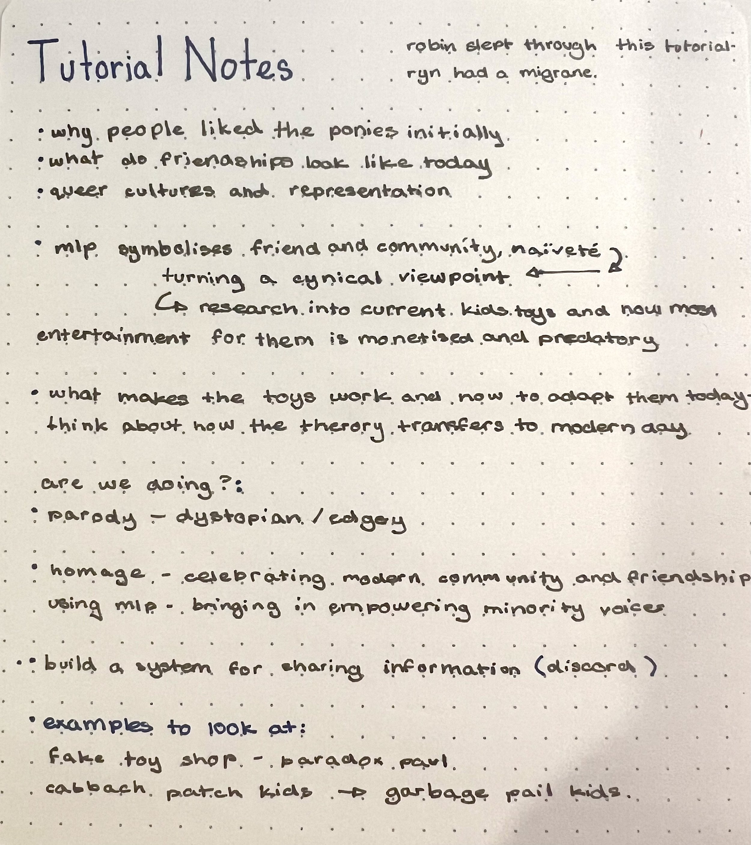
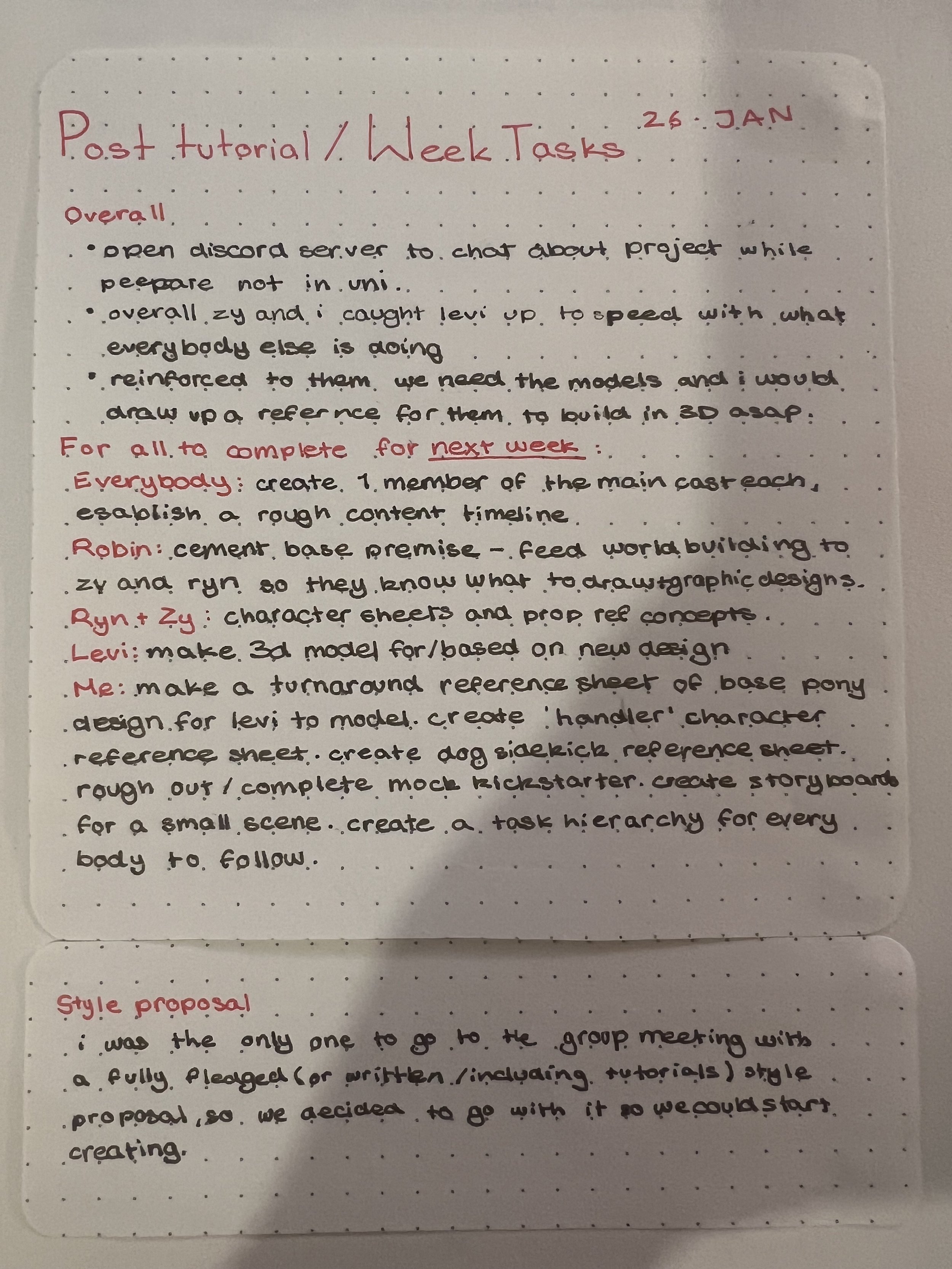


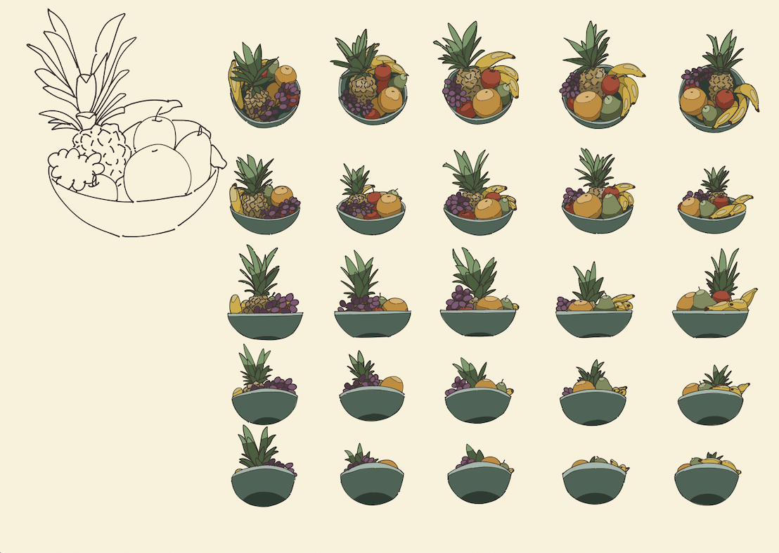
29 Jan - pony proportions reference sheet given to levi to create 3D model, 31 Jan - handler and fruit bowl style reference sheet


Unrefined sketches made earlier in the week 5th - 7th ish


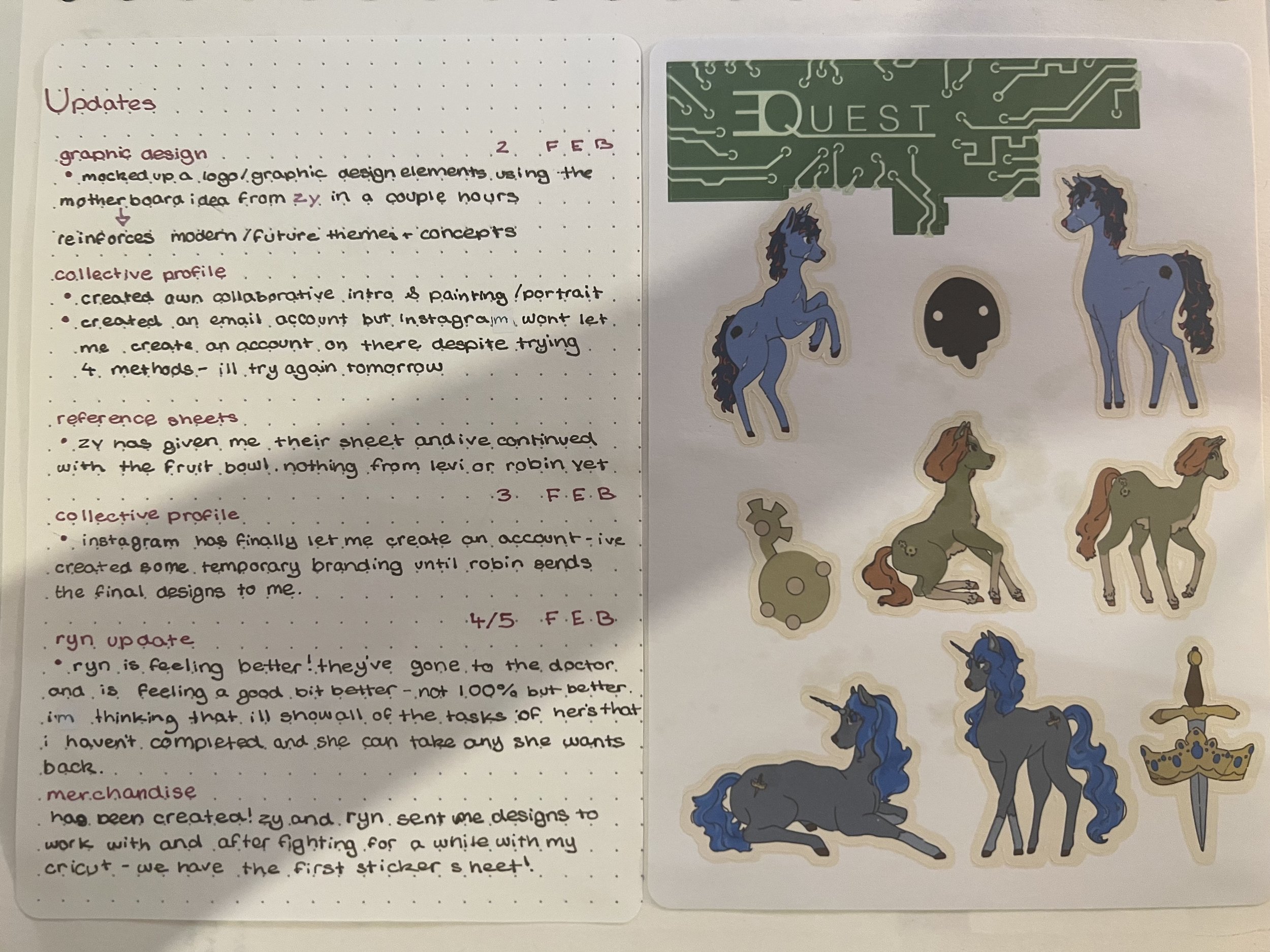
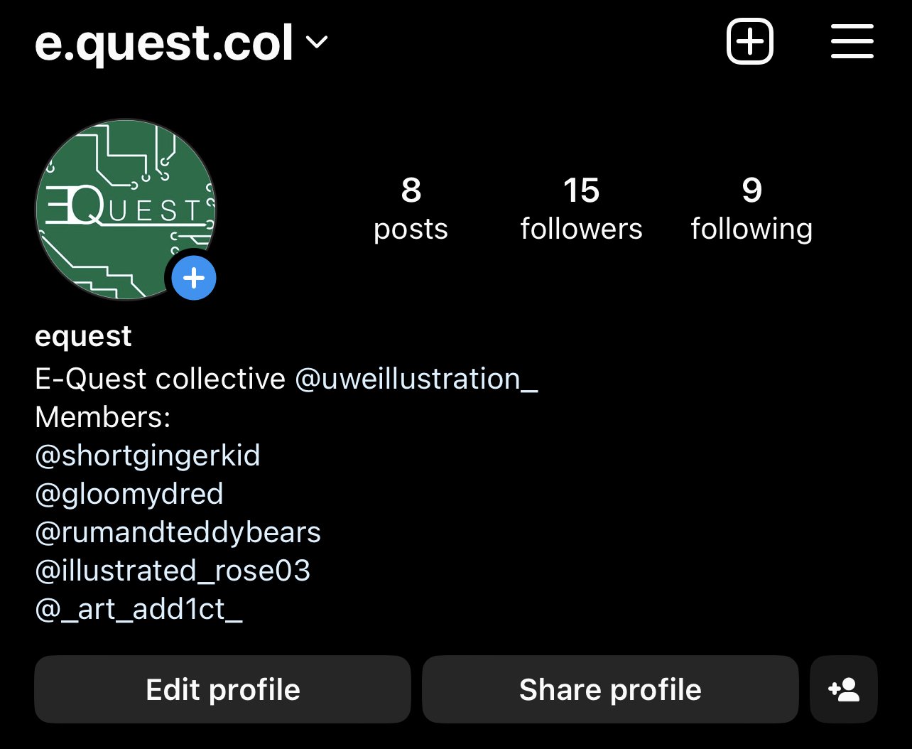
The Equest logos were rough graphics I created while waiting for Robin to create the final ones as per in their tasklist. They never ended up creating any so we continued with my designs for the Instagram account. I also created my intro self portrait graphic at the same time with some personal work in the background for the Insta account.
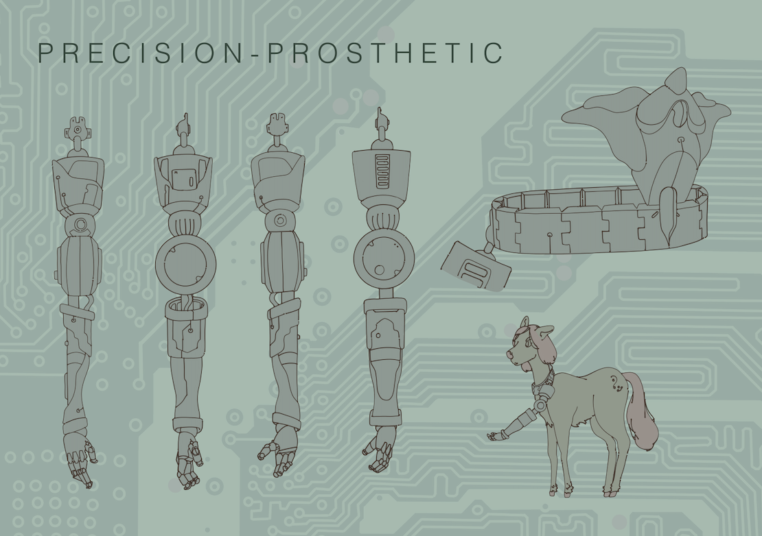
The arm prosthetic is for the use of the earth ponies as they are incapable of precision work due to thair lack of magic/wings. Hints of disability representation (that never appeared in the original toys) but I wont be fleshing it out any further than a vauge concept/hint.
The dog sidekick is bassed off of a recurring small dragon character that appeared in the sticker books, annuals and the movie throughout gen 1 and 2. I’ve redesigned him into a boston dynamics type dog to include design elements that modern viewers would recognise
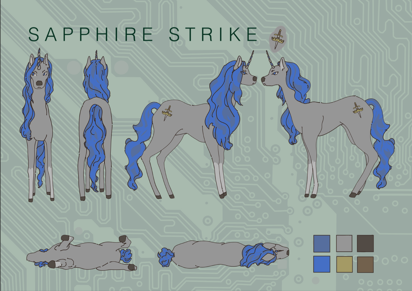
Finished the male turnaround sheet for levi to use to model off of. My character Lyra Lunix (Linux but switched lol). Is a computer tech without the tomboy/ “its a mans job so they must look like a man”. The different outfits for her gave me a chance to directly revisit the 80s/90s toy outfits. The combat and gala designs are taken from the sets ‘Pony Luv’ and ‘Academy Award’, with a few edits to colours and patterns to allign them with modern fashion trends.
The purple pony is the ‘handler’ character, meant to give the protagonists mission info in the story- just a rough character to add some aging into the designs as something like that doesn’t appear in the original toys.
Refined book pages 8th - 9th


Merchandise progress


Research


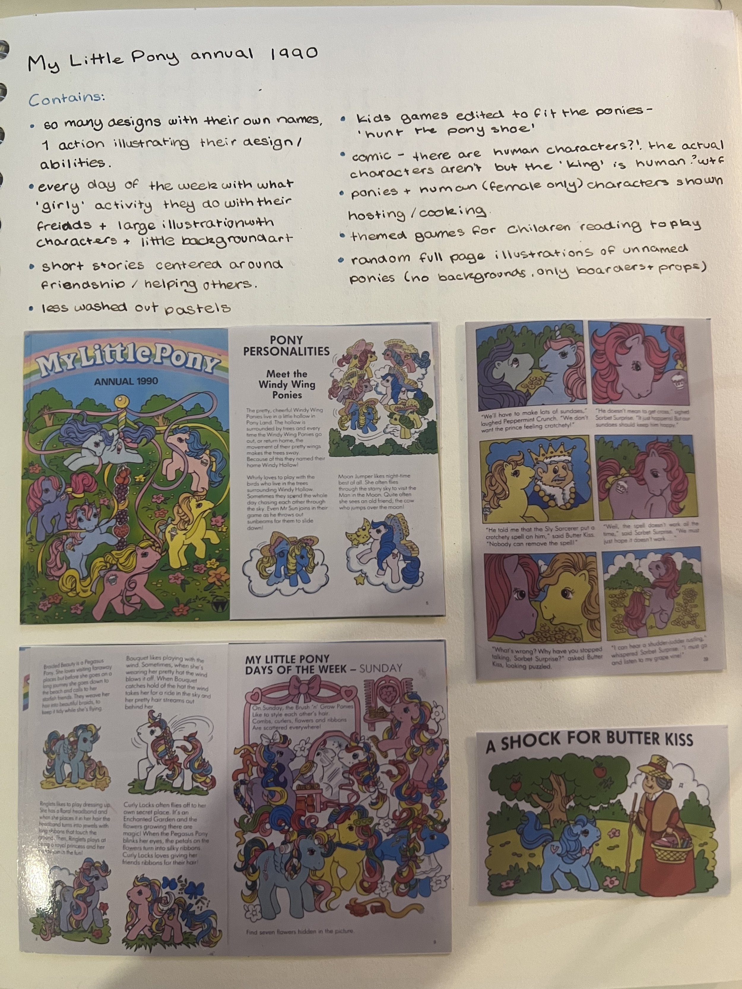
The glaringly pink retro musings website has been a great resource during this project. While they don’t document the MLP annuals or other associated media, they detail the toys with great detail and photographic documentation- a fab little treasure trove of info! I used it to find the outfit bases to take for the project.
That little green buck-toothed character on the right is what I based the RoboDog on, and that particular photo is from the sticker book that was released in the 80s.
The other research was mostly done through Ebay listings. Not many places detail the non-toy side of the MLP franchise, and while not offering the greatest photographic evidence/documentation, it did give me the assurance that these were actual products that existed- and not either modern fanart in the style of the older media or a.i. generated. It also gave me ideas on what merch to create as I could finally move onto the orginal objective I set out for myself. I took the idea of a cassette soundtrack for the imaginary series directly from the movie cassette and the fact that modern productions are still releasing them today (the Barbie movie had multiple avalible cassettes released). I want to do posters but tshirts, stickers, the zoetrop and cassettes are the priority.


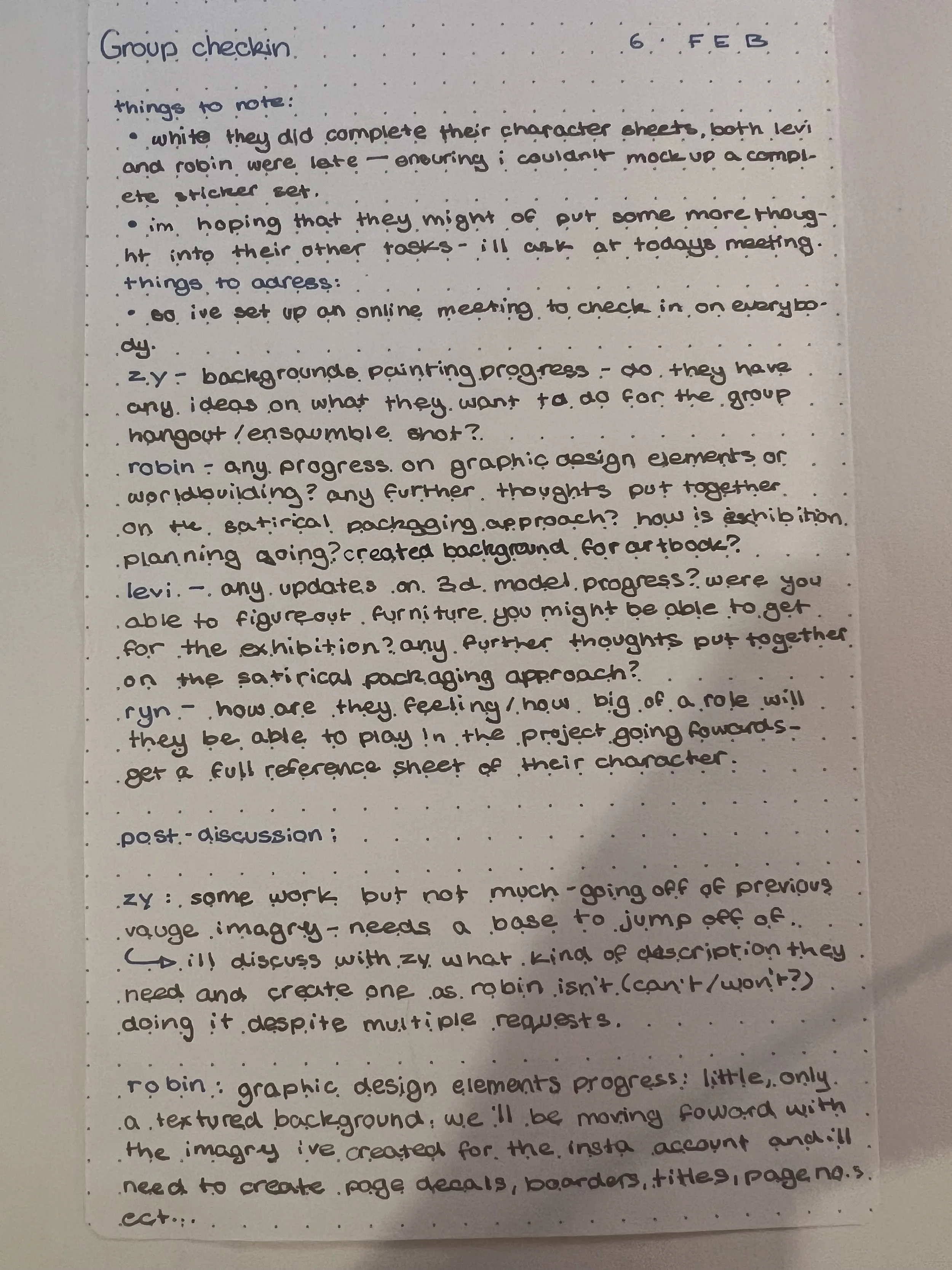
Zy desperatley needed some reference and seeing as Robin wasn’t doing it- I had to step in and throw something together so Zy could get started. This means I couldn’t think about all the themes we wanted to be baked into the visual design as Robin hadn’t handed over a comprehensive list, so I tried to lean towards a modern advanced future where current issues such as extreme poverty vs extreme wealth, technological gaps and access to basic necessities are all pushed to the brink and extremely prevelent in everyday life.
Featuring Ghost in the shell (1995), Nier Automata, Boston Dynamics and the architecture of Ludwig Godefroy.
damn… that was… productive.
Traditional Feminity
The annuals and sticker books all present a very ‘traditionally feminine’ lifestyle and traits within the ponies. They grow flowers, decorate eachothers hair, play dress up and bake and decorate- which is offered as the complete and utter sum of their personalities and capabilities. They don’t take any jobs that have agency, their not shown to be independant or smart- they just do ‘frilly girly things’.


THE APPROACH
To challenge the traditional presentation of feminity that is featured in the 1982 and 1997 My Little Pony toylines by creating and featuring developed female chacters and a focus on representing queer relationships. Manifesting in wearable merchandise, an art book detailing the visual elements and chacters of this new approach, and sticker sheets deploring character dynamics and queer relationships.
THE FINAL STRETCH
Finally get to manifest the approach through merch. yippee.
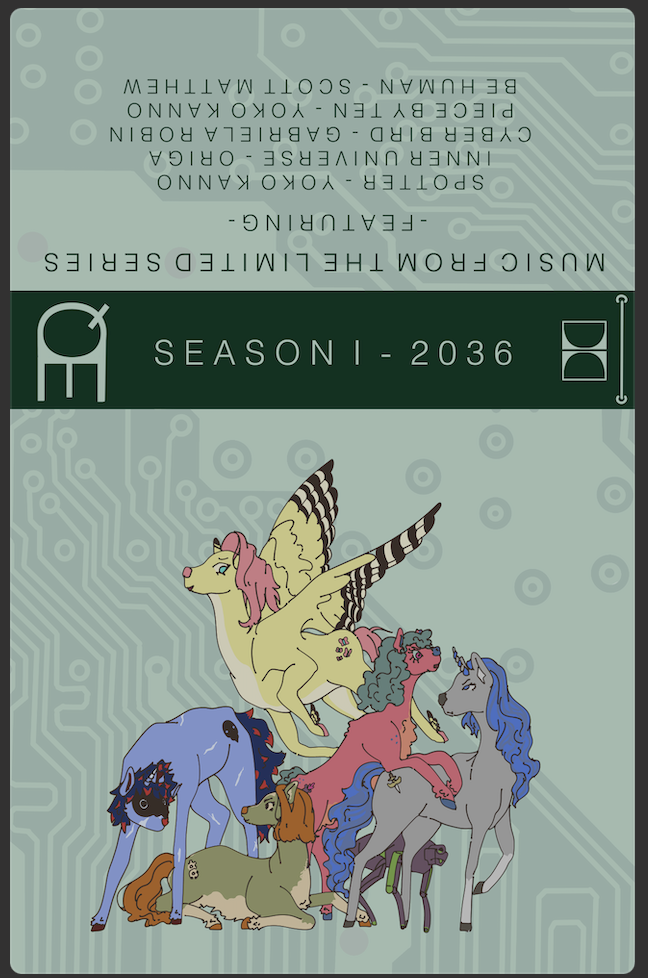
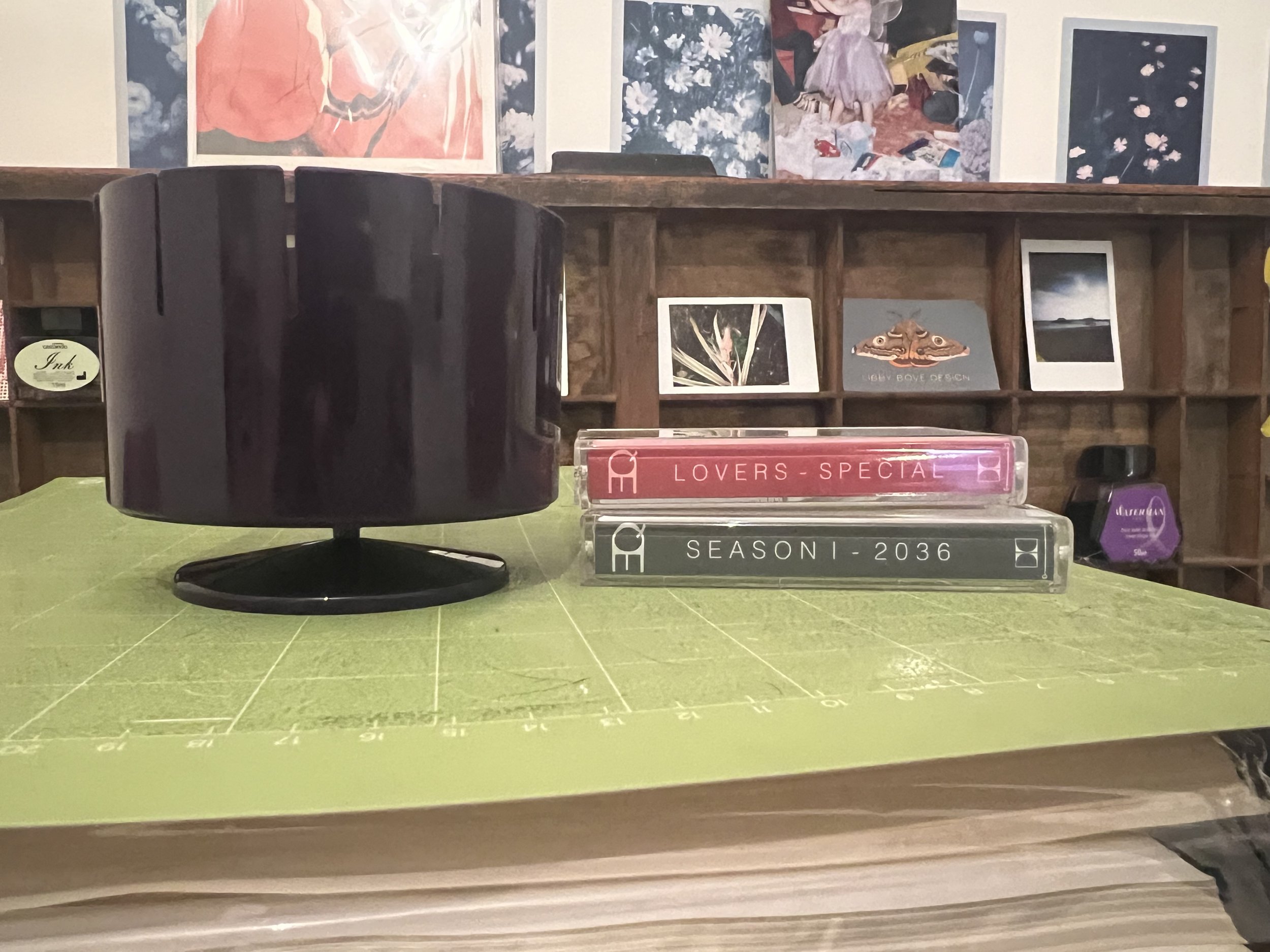
Zoetrope for the exhibition toyshop theme and the cassettes were first to be completed. The zoetrope strips are like 5mm short and the cassettes took about 4 different sizing adjustments but they are done. To push the queer relationship angle I created a ‘Lovers Special’ a valentines-esc album featuring various love songs/queer artists with an illustration my queer couple on the front.


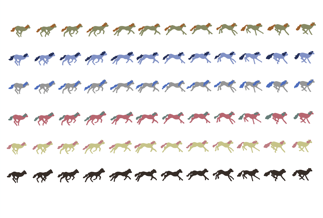
I created the zoetrope strips from publically avalible archives and overdrew it with the pony designs, recolouring to represent each character in their most basic recognisable forms.
THE ARTBOOK
It ended up being 32 pages and most of my work over the last few days has included creating Mrs Lunix as a part of my approach, formating Zy and Ryns work onto pages and the background I drew, and adding ‘chapter’ titles and descriptions. Also had to draw out Sucker Punch and Sapphire Strikes outfits. The steak, fish and chicken on the consumables page were redrawn by me to fit into the style we agreed on with lineart, colouring and shading. I also had to edit various elements of Ryns work to fit into the colour scheme and make the lineart a little more consistent.


The artbook is mainly here to introduce the chacters visually and as a host to Zy and Rynnys work. In my view it was more of a manifestation of the artwork existing outside in the world. For the full book please see the Apply tab- all work apart from the four background illustrations (Zy) and most of the props (Rynny) was created and formatted by me.
While it was originally meant to be a style reference for animators, as Robin and Levi shifted towards a toyshop presentation instead of animated show pitch- the book and my work refocused to be merchandising released with a new revival of the MLP franchise. On Friday 16th I sent it off to the print department for it to be printed and perfect bound.
TSHIRTS
I decided to do one group character focussed design as a ‘wider’ marketing demographic, and one design featuring my queer couple Mrs and Mrs Lunix to demonstrate how my approach would manifest in its final form.


I edited the previously used illustrations to make the lines thicker and remove smaller elements that I didn’t think would cut well on the heat transfer vinyl for the tshirts. I took a bit of a gamble with the Mrs & Mrs design and unfortunatley it didnt pay off, despite cutting three designs only one was able to be used for the shirt as the others broke during the weeding process.


Im still new to creating designs on my cricut and due to the backlog I ended up having to use it (over using uni facilities) otherwise it wouldn’t be completed intime for the start of the exhibition setup on the 19th. One of the group designs ran off of the vinyl so Scala lost her foot- and the actual weeding of the designs took nearly 45 mins for every. single. design. It was torture and I definatley wont be making such complicated designs in the future.
I chose some oil spill colour vinyl and some pearlescent to call back towards the original toylines bright colours and sparkles.


Transfer was a bit of a nightmare and I lost some of the designs lines in the process, but luckily nothing that ruined the presentation. For the full collection please view the Apply post.
STICKERS
For the three sticker sheets I resued the group illustration that features on the art book cover, nicked the coloured robodog from his character sheet and drew up a shortened EQuest logo. The second sheet was bassed on various photos of deers mid movement I found online, I took the poses and applied the main pony characters, as well as the Handler chacter, to them with their various outfits. The final sheet was dedicated to my approach and this is where I decided to go HAM with the queer themeing. It is as blatent and as handfisted as I could make to to ensure it came accross to viewers. It features various couple shots of Mrs and Mrs Lunix, the Bisexual and Lesbian flags and loveheart symbols.


I continued to use the background that I designed earlier on to keep consistent themeing. The sheets were transferred to my cricut to be cut and trimmed.
FINAL STEPS
On Monday 19th I dropped off the stickers, zoetrop, cassettes, tshirts, and picked up the artbook. I built my clothes rail, popped the tshirts on and met with Levi and Robin. As they were the two exhibition leads I was happy to leave the finished merchandising in their hands to present as they saw fit. The last few days being dedicated to making sure this website is updated and polishing any loose ends in my work. While I had hoped to make some art card merchanding centred around Mrs and Mrs Lunix, as well as developing Lyra’s character and tech-but-not-tomboy presentation, I simply don’t have the time and don’t want to rush out some half finished elements. Maybe if I get the time I’ll sketch some concepts but that’ll be the extent of it. To see the exhibtion process please visit Robins, Levis or Ryns websites.

Apply
Final Exhibition
ARTBOOK


CASSETTE SOUNDTRACKS


STICKER SHEETS


CLOTHING
designs


application


ZOETROPE

REFLECTION
In the early stages of this project I emerged as the unofficial leader, as I organised our group discussions and came to them with an agenda to address and really tried to drive the others into jumping into the project as quickly as possible. I set tasks for others to follow and at the start of the project we went with my suggestion for the exhibition/project: a showpitch for a reboot of the My Little Pony franchise (after Levi had brought up MLP). Throughout the project I have organised group discussions, weekly task setting, reviews of work progress and created tasks and goals for members to complete and engage their interests.
For the project I created: 26 of 32 artbook pages, formatted all artbook pages, the backgrounds for the art book, four characters, worldbuilding guides, three sticker sheet designs, two custom cassettes, two clothing designs applied to five t-shirts, a zoetrope and the group instagram account.
This was my first experience of working in a group collective and- it's certainly not been the best experience. The mental load of chasing people for updates, re shifting timelines and ideas, having people not communicate (Robin) or simply not paying attention to established decisions, was frustrating to say the least. This led me to withdraw at the end to try and finish the tasks I had set for myself at the beginning of the project- which is certainly not what a good leader should do.
The short deadline was very exciting and I loved it. It pushed me to shorten my typical timeline and finish my tasks to a high degree, so I’m quite proud of that. It also pushed me into an area of illustration I’ve never explored before- merchandising. It was interesting to approach several different outcomes with the internal priorities of an illustrator.
For the project approach, it shifted throughout the weeks. At first we were relying on another group member to establish a premise, but Paul guided us into thinking of each group member having their own approach to the revisit/remake theme. After researching associated MLP media I decided to challenge its traditional femininity by presenting career driven queer female characters- and I think I’ve been successful. It’s most blatant in my Mrs & Mrs Lunix sticker sheet, but I think the approach comes across in all my outcomes (apart from the zoetrope- that's really just an interactive toy).
The exhibition research led me to understanding the impact the surrounding area or setup can have on an exhibition and how that can enhance a viewer's experience. For the project exhibition I stepped back and allowed the other members of the group to take charge of the presentation whilst I created the bulk of content that would be featured within it. Seeing as I didn’t involve myself with the planning or execution I don’t have much of a leg to stand on when it comes to criticising the exhibition. However I simply didn’t like it, in my opinion it didn’t satirise the original toys well, or display the content in a way that engaged the audience or prompt them to interact. I have no idea where the outsourced labour or blood and viscera comments came from that were written on the walls. The colour schemes of the merch vs packaging vs decor clashed majorly- and in the end it looked like a convention merch table. I wish I involved myself more but after taking on so many tasks from other people (whether due to medical reasons or simply not doing set tasks) I simply did not have the time.