Develop
Aim: To Revisit / Remake an existing artwork or artefact.
The theme Revisit / Remake will challenge your ability to extend the reading of an existing artwork / artefact. It is important that your source is associated with practitioners or disciplines that do not consider their outcomes or thinking to align with Illustration (when considering established / traditional definitions). This may include, Fine Art, Fashion, Product Design or Architecture for example. However, your visual response must situate the new ‘revisited / remade’ work back into an Illustration context. Therefore, the resulting work must be able to demonstrate how it can be considered as being different from the selected source. The final part of the develop component will require students to progress from content maker to content commentator. Here the author of the remake will consider whether the new work is either a homage or parody of the original.


my style proposal for the project- in the style of a tutorial sheet for others to follow.


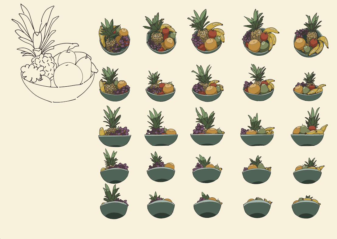
29 Jan - pony proportions reference sheet given to levi to create 3D model, 31 Jan - handler and fruit bowl style reference sheet


Unrefined sketches made earlier in the week 5th - 7th ish


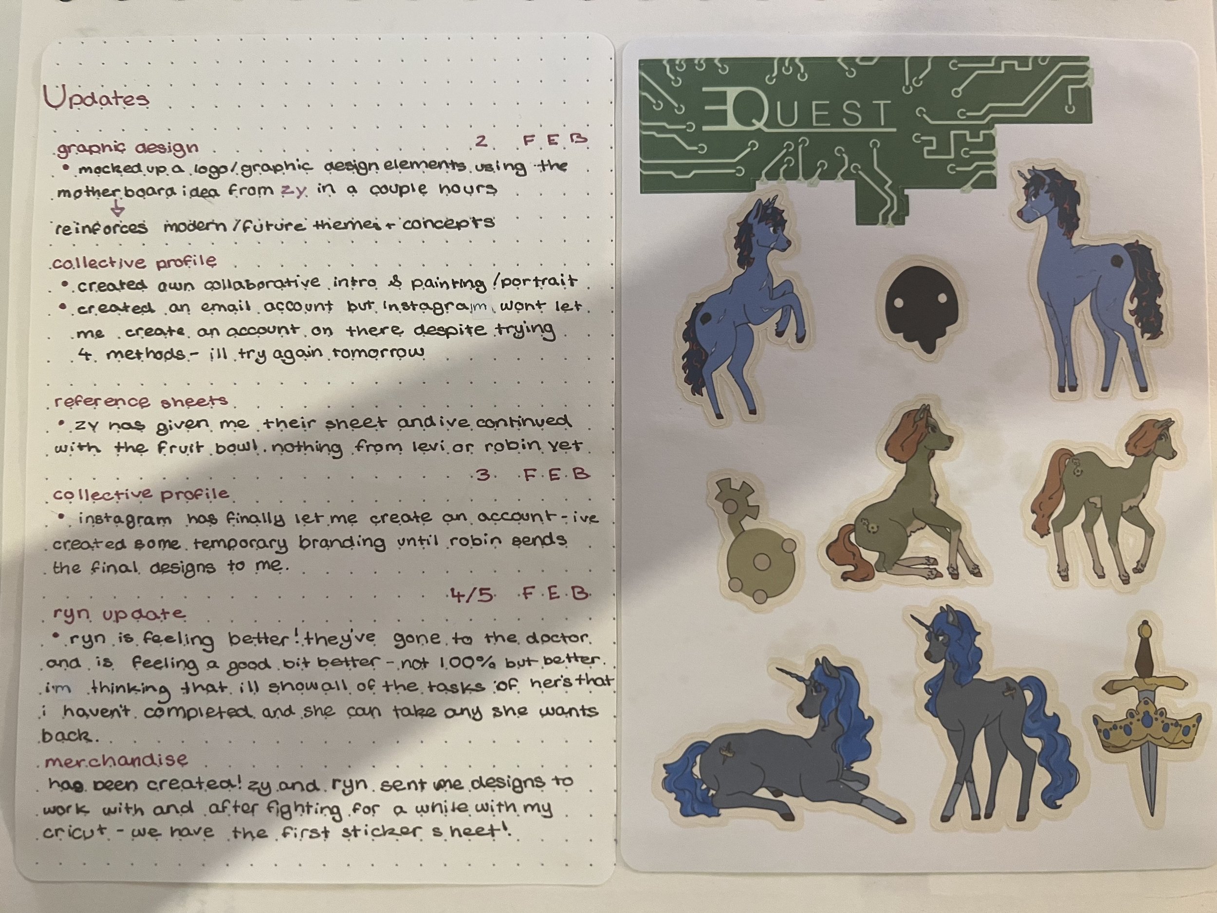
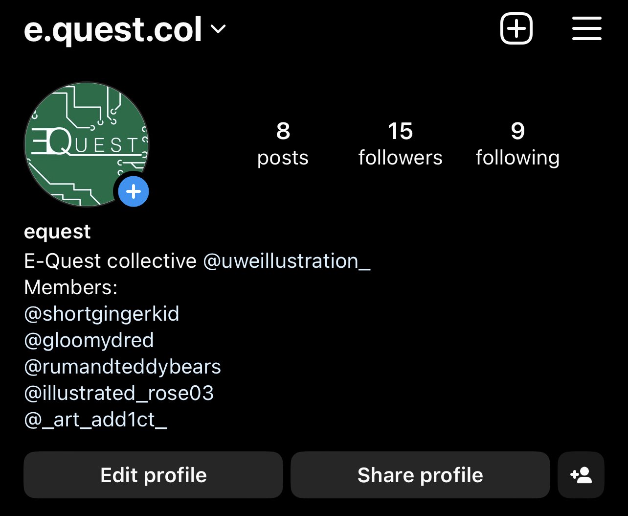
The Equest logos were rough graphics I created while waiting for Robin to create the final ones as per in their tasklist. They never ended up creating any so we continued with my designs for the Instagram account. I also created my intro self portrait graphic at the same time with some personal work in the background for the Insta account.
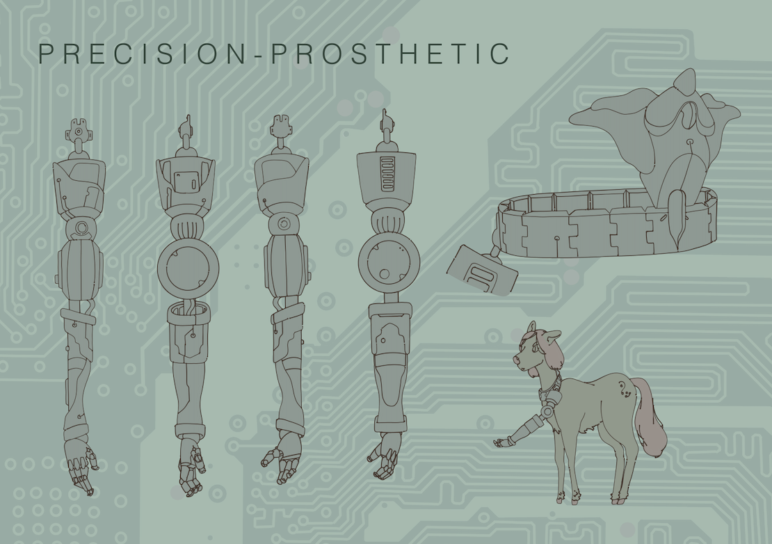
The arm prosthetic is for the use of the earth ponies as they are incapable of precision work due to thair lack of magic/wings. Hints of disability representation (that never appeared in the original toys) but I wont be fleshing it out any further than a vauge concept/hint.
The dog sidekick is bassed off of a recurring small dragon character that appeared in the sticker books, annuals and the movie throughout gen 1 and 2. I’ve redesigned him into a boston dynamics type dog to include design elements that modern viewers would recognise
Finished the male turnaround sheet for levi to use to model off of. My character Lyra Lunix (Linux but switched lol). Is a computer tech without the tomboy/ “its a mans job so they must look like a man”. The different outfits for her gave me a chance to directly revisit the 80s/90s toy outfits. The combat and gala designs are taken from the sets ‘Pony Luv’ and ‘Academy Award’, with a few edits to colours and patterns to allign them with modern fashion trends.
The purple pony is the ‘handler’ character, meant to give the protagonists mission info in the story- just a rough character to add some aging into the designs as something like that doesn’t appear in the original toys.
Refined book pages 8th - 9th


Merchandise progress


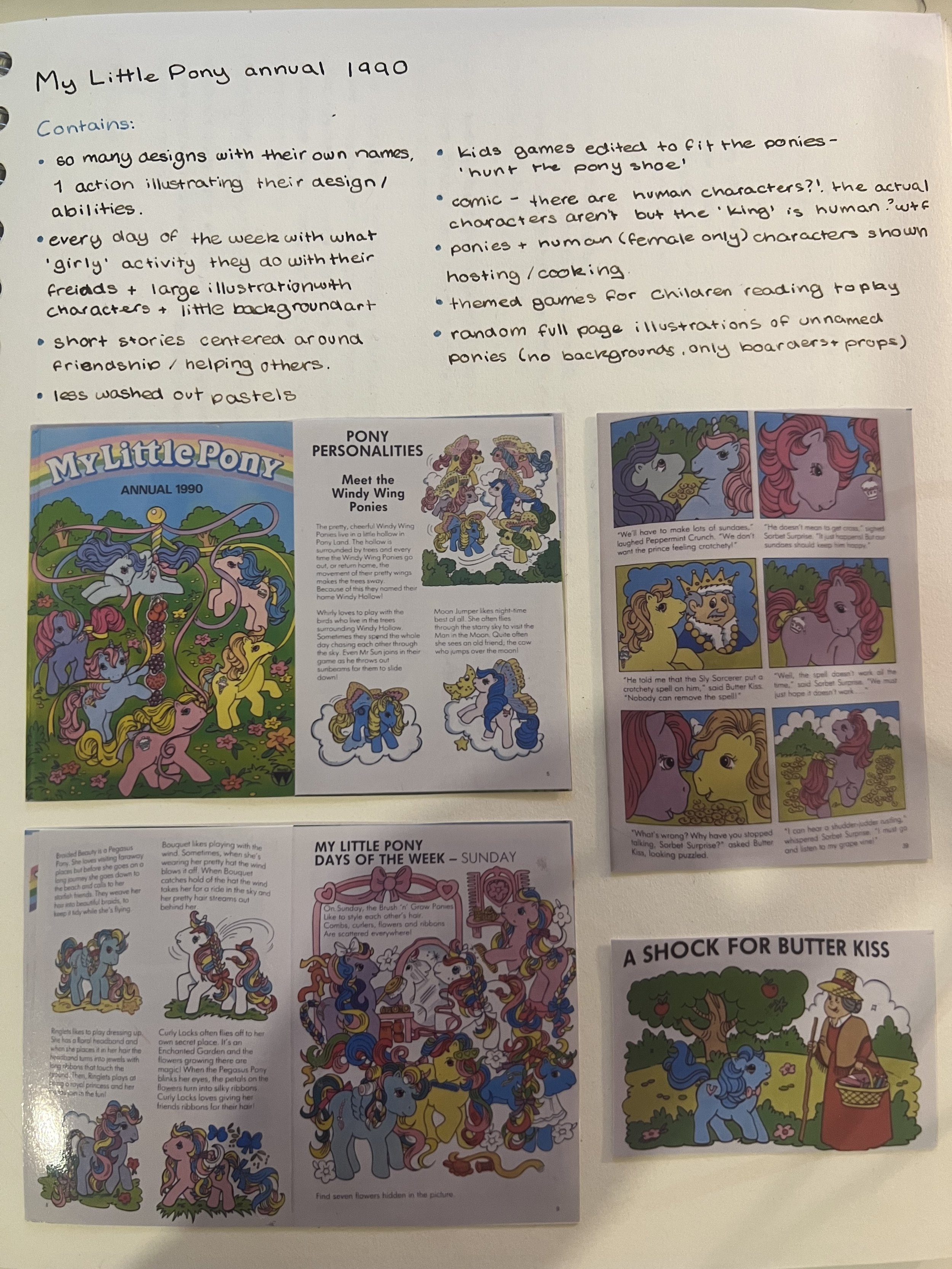
Research


The glaringly pink retro musings website has been a great resource during this project. While they don’t document the MLP annuals or other associated media, they detail the toys with great detail and photographic documentation- a fab little treasure trove of info! I used it to find the outfit bases to take for the project.
That little green buck-toothed character on the right is what I based the RoboDog on, and that particular photo is from the sticker book that was released in the 80s.
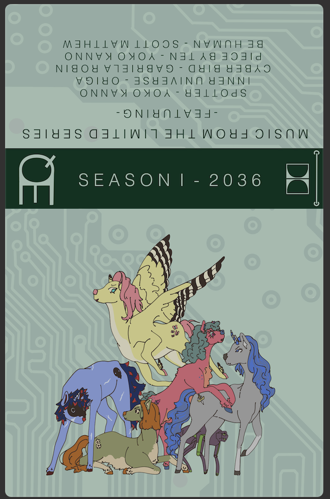
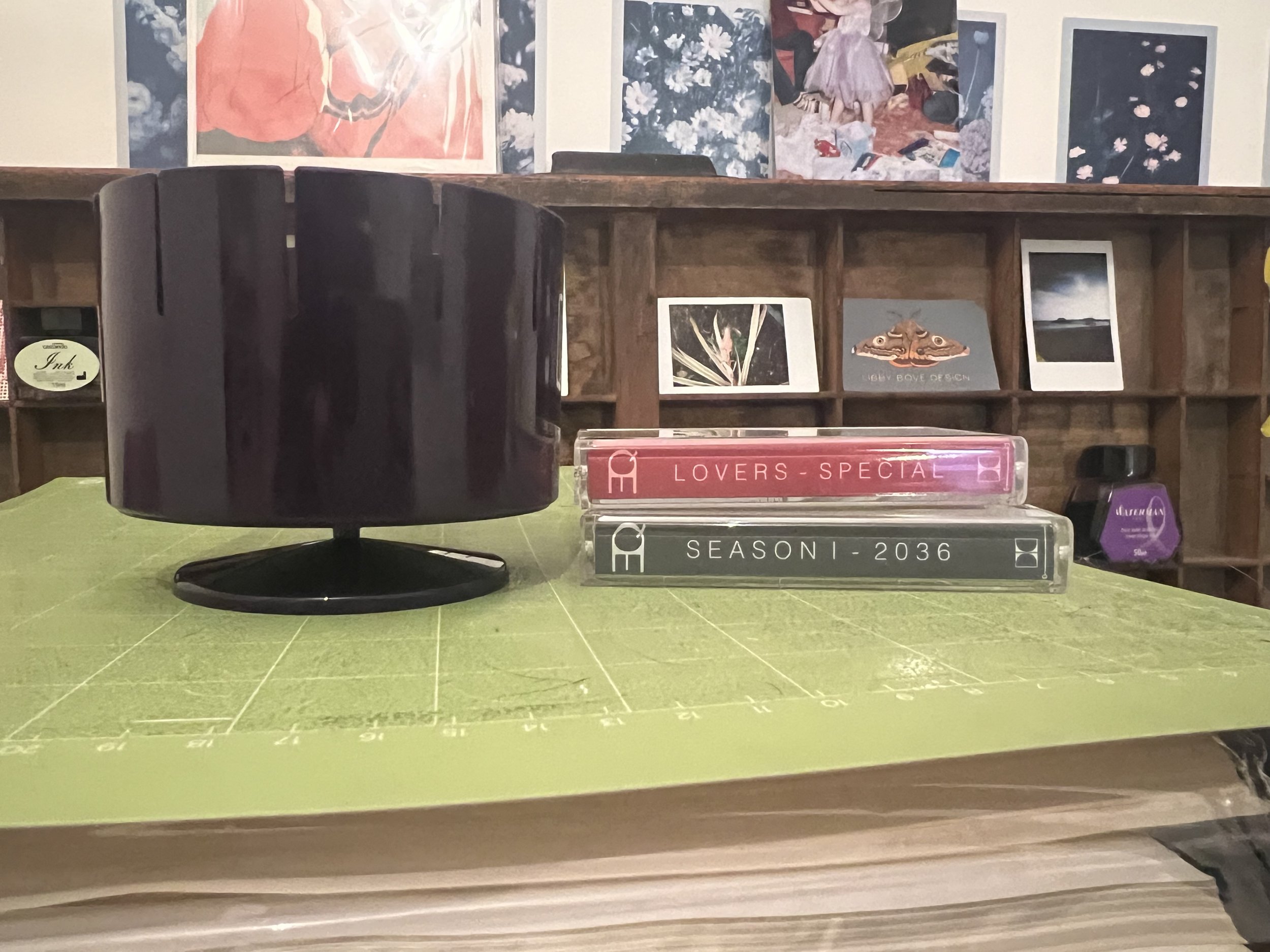
The other research was mostly done through Ebay listings. Not many places detail the non-toy side of the MLP franchise, and while not offering the greatest photographic evidence/documentation, it did give me the assurance that these were actual products that existed- and not either modern fanart in the style of the older media or a.i. generated. It also gave me ideas on what merch to create as I could finally move onto the orginal objective I set out for myself. I took the idea of a cassette soundtrack for the imaginary series directly from the movie cassette and the fact that modern productions are still releasing them today (the Barbie movie had multiple avalible cassettes released). I want to do posters but tshirts, stickers, the zoetrop and cassettes are the priority.


Zy desperatley needed some reference and seeing as Robin wasn’t doing it- I had to step in and throw something together so Zy could get started. This means I couldn’t think about all the themes we wanted to be baked into the visual design as Robin hadn’t handed over a comprehensive list, so I tried to lean towards a modern advanced future where current issues such as extreme poverty vs extreme wealth, technological gaps and access to basic necessities are all pushed to the brink and extremely prevelent in everyday life.
Featuring Ghost in the shell (1995), Nier Automata, Boston Dynamics and the architecture of Ludwig Godefroy.
damn… that was… productive.
Traditional Feminity
The annuals and sticker books all present a very ‘traditionally feminine’ lifestyle and traits within the ponies. They grow flowers, decorate eachothers hair, play dress up and bake and decorate- which is offered as the complete and utter sum of their personalities and capabilities. They don’t take any jobs that have agency, their not shown to be independant or smart- they just do ‘frilly girly things’.


THE APPROACH
To challenge the traditional presentation of feminity that is featured in the 1982 and 1997 My Little Pony toylines by creating and featuring developed female chacters and a focus on representing queer relationships. Manifesting in wearable merchandise, an art book detailing the visual elements and chacters of this new approach, and sticker sheets deploring character dynamics and queer relationships.
THE FINAL STRETCH
Finally get to manifest the approach through merch. yippee.
Zoetrope for the exhibition toyshop theme and the cassettes were first to be completed. The zoetrope strips are like 5mm short and the cassettes took about 4 different sizing adjustments but they are done. To push the queer relationship angle I created a ‘Lovers Special’ a valentines-esc album featuring various love songs/queer artists with an illustration my queer couple on the front.


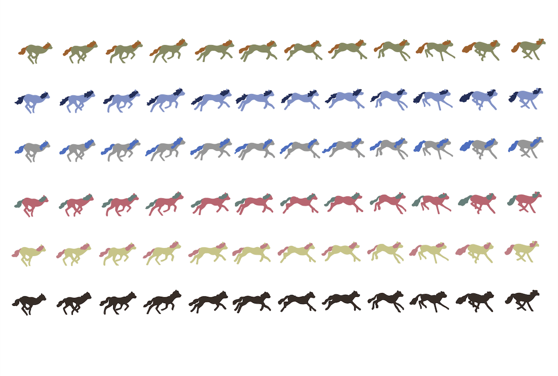
I created the zoetrope strips from publically avalible archives and overdrew it with the pony designs, recolouring to represent each character in their most basic recognisable forms.
THE ARTBOOK
It ended up being 32 pages and most of my work over the last few days has included creating Mrs Lunix as a part of my approach, formating Zy and Ryns work onto pages and the background I drew, and adding ‘chapter’ titles and descriptions. Also had to draw out Sucker Punch and Sapphire Strikes outfits. The steak, fish and chicken on the consumables page were redrawn by me to fit into the style we agreed on with lineart, colouring and shading. I also had to edit various elements of Ryns work to fit into the colour scheme and make the lineart a little more consistent.


The artbook is mainly here to introduce the chacters visually and as a host to Zy and Rynnys work. In my view it was more of a manifestation of the artwork existing outside in the world. For the full book please see the Apply tab- all work apart from the four background illustrations (Zy) and most of the props (Rynny) was created and formatted by me.
While it was originally meant to be a style reference for animators, as Robin and Levi shifted towards a toyshop presentation instead of animated show pitch- the book and my work refocused to be merchandising released with a new revival of the MLP franchise. On Friday 16th I sent it off to the print department for it to be printed and perfect bound.
TSHIRTS
I decided to do one group character focussed design as a ‘wider’ marketing demographic, and one design featuring my queer couple Mrs and Mrs Lunix to demonstrate how my approach would manifest in its final form.


I edited the previously used illustrations to make the lines thicker and remove smaller elements that I didn’t think would cut well on the heat transfer vinyl for the tshirts. I took a bit of a gamble with the Mrs & Mrs design and unfortunatley it didnt pay off, despite cutting three designs only one was able to be used for the shirt as the others broke during the weeding process.


Im still new to creating designs on my cricut and due to the backlog I ended up having to use it (over using uni facilities) otherwise it wouldn’t be completed intime for the start of the exhibition setup on the 19th. One of the group designs ran off of the vinyl so Scala lost her foot- and the actual weeding of the designs took nearly 45 mins for every. single. design. It was torture and I definatley wont be making such complicated designs in the future.
I chose some oil spill colour vinyl and some pearlescent to call back towards the original toylines bright colours and sparkles.


Transfer was a bit of a nightmare and I lost some of the designs lines in the process, but luckily nothing that ruined the presentation. For the full collection please view the Apply post.
STICKERS
For the three sticker sheets I resued the group illustration that features on the art book cover, nicked the coloured robodog from his character sheet and drew up a shortened EQuest logo. The second sheet was bassed on various photos of deers mid movement I found online, I took the poses and applied the main pony characters, as well as the Handler chacter, to them with their various outfits. The final sheet was dedicated to my approach and this is where I decided to go HAM with the queer themeing. It is as blatent and as handfisted as I could make to to ensure it came accross to viewers. It features various couple shots of Mrs and Mrs Lunix, the Bisexual and Lesbian flags and loveheart symbols.


I continued to use the background that I designed earlier on to keep consistent themeing. The sheets were transferred to my cricut to be cut and trimmed.
FINAL STEPS
On Monday 19th I dropped off the stickers, zoetrop, cassettes, tshirts, and picked up the artbook. I built my clothes rail, popped the tshirts on and met with Levi and Robin. As they were the two exhibition leads I was happy to leave the finished merchandising in their hands to present as they saw fit. The last few days being dedicated to making sure this website is updated and polishing any loose ends in my work. While I had hoped to make some art card merchanding centred around Mrs and Mrs Lunix, as well as developing Lyra’s character and tech-but-not-tomboy presentation, I simply don’t have the time and don’t want to rush out some half finished elements. Maybe if I get the time I’ll sketch some concepts but that’ll be the extent of it. To see the exhibtion process please visit Robins, Levis or Ryns websites.