Developing and Making
For elements that I have actual canon visual reference for, I am going to try and recreate those elements to the best of my ability. However, some offical artworks contradict eachother, some designs I’ve had to pull from Drakengard 3 cutscenes composed of roughly three polygons, and with others I am going to edit due to material avalabilty, monetary and time constraints. Basically im going to try run with canon as much as possible, but when not- im running off of vibes
The Case
Accord’s case is, well, to put it lightly, fucking huge.

BRO THAT THING IS ATLEAST A METER WIDE
And while canon is king- finding a case that big is way out of my budget (i even looked at ebay, all were either too expensive or too far away to pick up) plus I am going to have to absolutly butcher anything I get my hands on, so borrowing is out of the question.
So, smol briefcase it will be :3
Resource Gathering
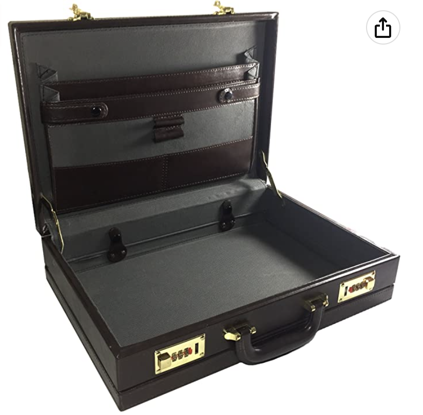
In comes in this little boi!
Mostly I chose this case because of its sharp right angle corners, which will make it a whole lot easier to add the case corner protectors/details that appear on Accord’s case. The non curved design will also make it easier to cover it seemlessly for a more put-together end look.
The current thoughts are to gut and re-cover the interior, remove the handle and current locks to replace with more accurate ones, re-covering the exterior with the hexagon pattern and finally adding the leather straps/elements.
One of the elements of the case I am not willing to compromise on is the fact that it needs a key lock. I doubt that I will be able to get one that looks like the actual lock on Accord’s case because while it looks pretty, it doesn’t look completely functional. After looking at locksmiths websites and prices, it seems as if the most affordable/least wasteful is to find a second hand case that has the elements I need, then butcher and transfer those elements to my Accord case.

ALL HAIL CHARITY SHOPS
I found this little perfect bean who has the right shape handle & design, as well as the metal elements being brass/gold coloured. But most importantly…
IT HAS ITS KEYS!!!!!
they are not as chonky as the ones seen in Accords official art, but the keys are functional and that is the most important thing. While the price point of the case ended up being more expensive than the actual briefcase (my bank account is crying), I considered the cost worth it due to the handle design, locks and keys, as well as able to have it with me immediatly and not have to wait for shipping or anything.
Gutting
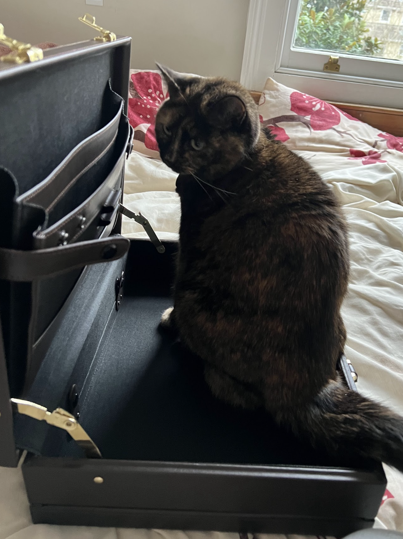
And thus the process begins! I had my handy helper Rin (as pictured) accompany me throughout the process!

The case for the most part was easy to deconstruct on the inside, the only thing I couldn’t remove were these little button clip things. Turns out that the case is extendable and these things keep the bottom in place. I tried to take them out but it made it unstable so they must be left in even if they affect the look of the inside.

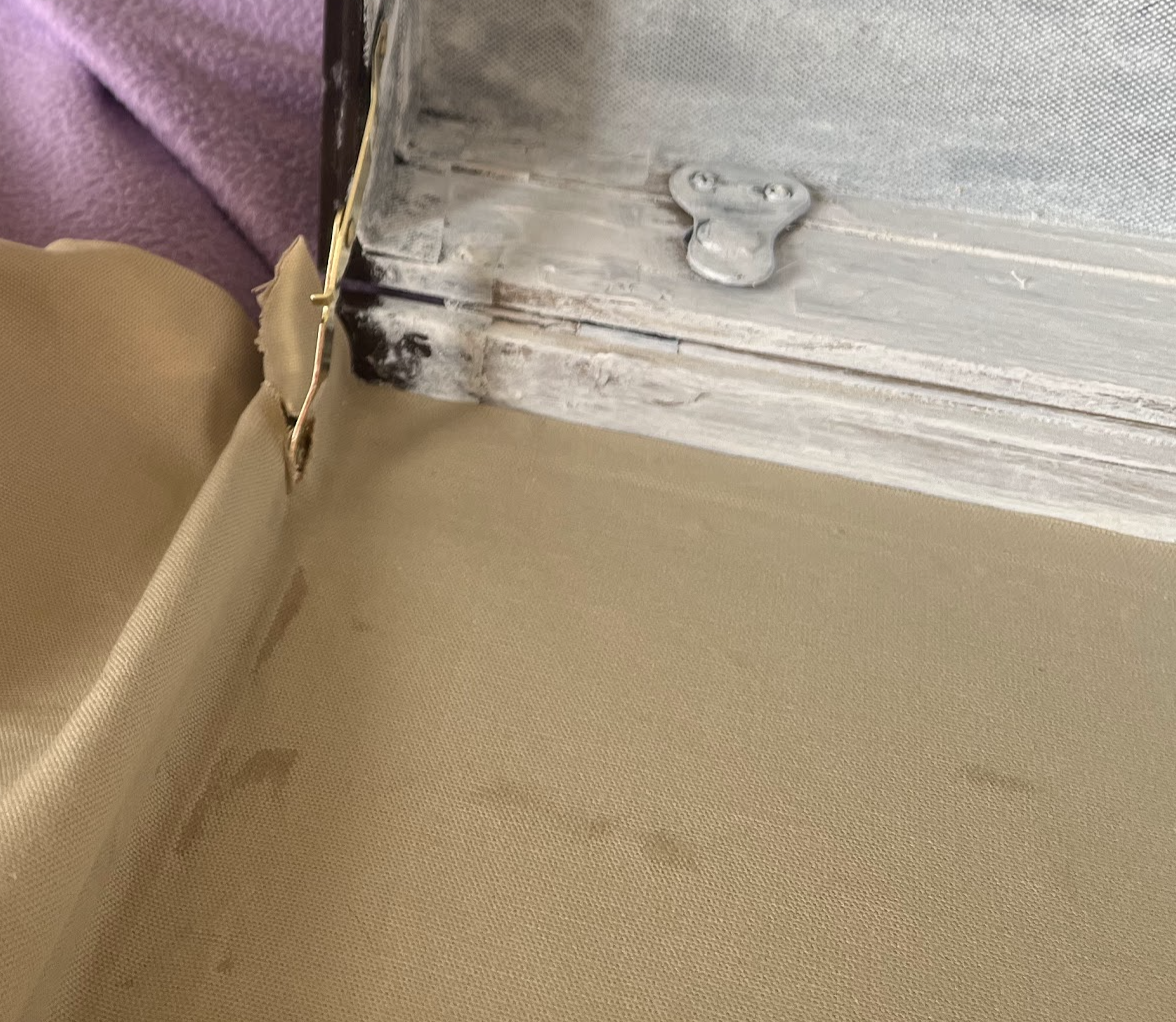
The outside was a little more difficult. Despite being so cheap the locks on the outside were a bugger to get off (this is certainly not due to the fact that I had no actual tools and decided that instead of getting any i would to go at it with some metal hinges and a wrench).

And the evidence of my destruction.
Do not ask be how i managed to do it with only a wrench and metal hinge because im pretty sure my mother would appear out of thin air to give you an explanation on my stubborness throughout the years.

Gutted and ready to be recovered into Accord’s case!


I also took apart the satchel at this stage, removing the locks and handle so that they could be transferred over to the case later on.
Recovering & Pattern Printing
Round 1


In round one of the covering process I had recovered the outside with cushion lining and the inside with linin (due to a lack of more cushion covering), cut the pattern elements, measured and printed the entire case and even got to the lock adding stage before realising.
I’d done it wrong.
On the short corners of the case, the patteren is meant to be continous, not the long front/back sides, which I had made it. There were a few other contributing factors such as pattern mistakes, visible superglue and I didn’t like the fabric change I had made for the inside and outside, that made me decide that I wanted to uncover and recover it again, because I knew I could do better.
Round 2


This time i made sure to fill the holes that were left in the case after taking the original locks out, to make a smoother and sturdier base for the fabric to be attached onto. Instead of superglue and pritstick to attack the fabric, I used a spray adhesive that didnt sink through the new fabric I had bought. For the printing, I used a transparent lino to minimise placement mistakes. I also seperated out the hexagons into sections so that the side wouldn’t overlap and double print, lessening the chance for mistakes.
Final Elements


For the leather straps I further cannibalised the satchel I bought, using superglue I attached the strips to the edges. The leather was quite stiff, and unfortunately pulled the fabric away from the case as a result. Luckily it wasn’t too horrific so I decided to move fowards with adding the other straps, corner squares, and cutting around the case feet. I decided to omit the middle crossed straps of Accord’s case as 1: despite going to various thrift stores/car boot sales and charity shops, I hadn’t found anything that could embody the same feeling as the metal seal on the center of her case, and 2: I didn’t have time to make a seal. I also felt that if I did add the middle straps, due to the cases size, it would become too crowded.
Then I added the lock and handle. Both were attached with superglue (honestly its been my best friend through all of this project) and I used left over leather to elevate 1/2 of the lock as he’s a littly funky boi who needs that to fit properly into his other half. Finally came the case corners! I ordered a set off of amazon and superglued them initially. Due to the thickness of the leather and the length of the corners, I had to bend the ends to make it fit and have a cleaner look than just… a floating edge. Then I added in the nails, luckily I had enough nails left over so I could use them to reinforce the leather straps aswell, which I feel really adds to the *serious case* vibe. Idk, it made it feel more important, something so tiny like that still being added and all.
The Book
The book will be comprised of two parts, the cover and the content.
The Cover
Reference:


Annoyingly as you can see, Accord’s book differs is its design between its appearances in Drakengard 3 and the SINoALICE offical crossover art. However as the references from the Drakengard 3 cutscenes have roughly three pixels worth of details, I’ll be taking most of the design elements from the Drakengard 3 design, and filling in the gaps with the SINoALICE design. I quite like the rustic old flock look of the Drakengard design, while the spine of the SINoALICE book design has a much more interesting look overall.

potential cover
In the earlier stages of shopping around for project elements, I stumbled upon this wonderful cover, full of depth and that musky forgotten in the attic kind of feeling. While it fit the vibe of the case and Accord, I decided that it was too different from the actual designs featured in art/the game, and I felt that where I could, I would like to stick as close to the canon designs as possible.
The Bookbinding Workshop
In our classes we have been shown how to create and cover our own books, a method I will now most certainly be utalising for this area of the project. If you want to see the content I made for that workshop, please see the previous post!
The Content
The content of the book will be a coprehensive timeline from the fifth ending of Drakengard (as detailed in my notes in the previous section), all the way up to the end of humanity, just after the end of Nier Replicant. The book will have footnotes to refer to the loose timeline sheets also in Accord’s case to view the branching timelines. However the book will contain the timeline that ultimatly leads to the events of Nier Automata (the canon complete timeline) .
It would take me forever to get a comprehensive grasp on the timeline if I tried to go to each and every primary source- some of which haven’t even been traslated to english, so I am going to use the information compiled in two different areas.
The various fan wiki timelines:
https://drakengard.fandom.com/wiki/Timelines#Branch_E
https://nier.fandom.com/wiki/Timelines
And fan translations:
Information translated and compiled by Rekka Alexiel, who runs https://firesanctuary.com/ , documenting Drakengard and Nier since 2005. An exel sheet documenting the timeline https://docs.google.com/spreadsheets/d/1DtXBGvR7rAxlApjf3n3uR3oH2keZ6c4RQvzUaJ2jj0U/edit#gid=0 from the birth of christ to the first civil war between the machines in the year 12543
A fan translation of the Nier Replicant companion book Grimoire Nier that has small bits of information regarding the timeline of events https://docs.google.com/document/d/1vEP2iZ52P-DWhQBQ2Is6R8Wjao99AGi0YuWShTvA-tA/preview
a random ass doc I found that actually kinda explains some confusion I was having so it gets to be here aswell, no idea as to who created it though https://docs.google.com/document/d/1IAVXkVvR2CThYnjMpv0C0TnjyD3XAcpFgB-oY_WfDcU/edit
I’m trusting of these sources because the people that run them, people like me, pride ourselves on being as accurate as we possibly can when it comes to our information. It’s a bit of a leap in faith but one I’m willing to take to save myself time. plus I can’t learn japanese in the span of five weeks so I’d be screwed if I didn’t use these sources anyway.
Text
After looking at and editing some of Fire Sanctuary’s exel sheet timeline, and nabbing some small tidbits from the other linked timelines, I have compiled it into a document that fits the avalible character limit (which is detailed in the sections below) so I don’t have to gamble concerning paper space.


I have not a clue why pages 15 and 16 are broken and after going through like 5+ iterations im just running with it and i’ll cross that bridge when I come to it.
The Earlier Tests


cries in having to deal with the shittery of google docs for four days straight
BUT IT’S DONE NOW SO ONTO THE OTHER BITS
In terms of fitting all of this content into a book, is where the tricky bit starts.
One: Formats. I need to research into different documenting formats, potentially looking at museums and archives to see how they format their works
Two: Typing Content. Printing this information is out of the question. the experiance to the viewer would be damped and im my opinion, ruined, if I simply printed it. I want there to be a sense that every page has been curated by hand, and I will do exactly that by using my typewriter- this is the reason I have not speculated much on my initial project ideas, I knew this element will take up the majority of the project time.
Three: Binding. I really want to use a coptic binding method for the book, I believe the presence of the thread and the minor inconsistences that binding it by hand will add alot of character to the final product. However this entails the folding of content sheets and the subsiquent complicated planning that will result. Current plan is to compile all the text the book will contain, figure out how much text will fit on each page considering format and boarders, then type one section, of one sheet, four pages, to see if it works.
Four: Paper. In the reference images it is clearly seen that the paper in Accord’s book is old and stained. I need to replicate this affect whilst also having the paper be thin enough, texturous enough (but not too much for the typewriter to handle), and sturdy enough to be stained, folded, ran through a typewriter and bound.
Formats
Researching Timelines
Accord as stated, is a recorder. She also has an air to her suggesting that she is from a time from before ours, I mostly get a mix of modern and victorian kinda feeling from her. So I decided to have a look at a few different ‘vintage’ time documents to get a feel before deciding on my own design.


Despite liking the really ye olde British Empire timeline thingie mc bop, it felt a little too confusing for the atmosphere I’m trying to create, I believe it will end up just creating frustration for the viewer rather than it being a ‘discovery’. Which lead be to old typewritten department memos. Not as horrifically confusing or a little too old like the empire timelines, but clear enough to be read, whilst still feeling as if you shouldn’t really take a look at it. But it just happens to be right there, a little glance can’t hurt, right?
Designing a Format
I took to my tried and tested method of drawing out a few potential ideas, and then creating a frankenstein combination of them to move forward with.

In the end I ended up going with a pretty simple and easy to read format, that for me gives off an impression of formality and governing order.
Binding
We had a heckin coolio book binding workshop that introduced us to various bookbinding techniques, and I’ll be utalising my new knowledge for this project!


I’m going to be using the coptic stitch because it gives that handmade kinda feel, a little rustic (atleast alot more that a perfect bind) vibe, and I think Accord is the kind of extras bitch who would demand a proper book.
Paper
First I’ll be trialing techniques to age the paper, and how well they can be ran through my typewriter afterwards.
Tiger Books - off white, unknown gsm but thin-ish, slightly rough
250gsm paper - white, thick
150 gsm paper - white, general sketching paper
80 gsm paper - white, thin, lots more content in a thinner space

Immediatly 80 gsm is out- it just can’t handle being coloured. 150 has the most consistant tolerance for the mediums, but personally the tiger paper is my favourite (apart from the ink sample). 250 warps a bit too much after drying but I’ll run it through my typewriter anyway.

250 gsm can hardly roll through my typewriter so it’s down at the bottom of the tierlist for now. While the 150 gives the ‘best’ text clarity, I still just really like the tiger paper. It’s feel, base tone and how soft it is just elevates it as an experiance. The largest I can get is A3, so I’ll buy some of that and use it for the next stages.


To batch stain paper I had initially planned to tie strig across an airer and clip the paper onto it to dry, but the airer is old and little bent, and it collapsed and comepletely ruined my first batch of paper. Ended up just using the airer without the string, painting the paper in the gouache paint mix and clipping it to the bars to dry in sets of 15 pages.

Typing

The Book Content Setup
To type the book content, this was my setup! Pages drawn with soft pencil measured outlines to keep my typing in line, my laptop with the text and my typewriter elevated and cushions to minimise the amount of noise made.
I did run into a couple of hiccups whilst typing however. I allowed for a few mistakes per sheet (four pages) but if it got too much or too noticable, I would restart the sheet. One time I managed to miss the entire second to last paragraph at the end of a fully typed sheet and had to completely re-do it *cries*.
Also the tiger paper was quite fragile after being ran through the typewriter, and so I had to redo the first couple of sheets after handleing them too roughly and breaking them.
Binding


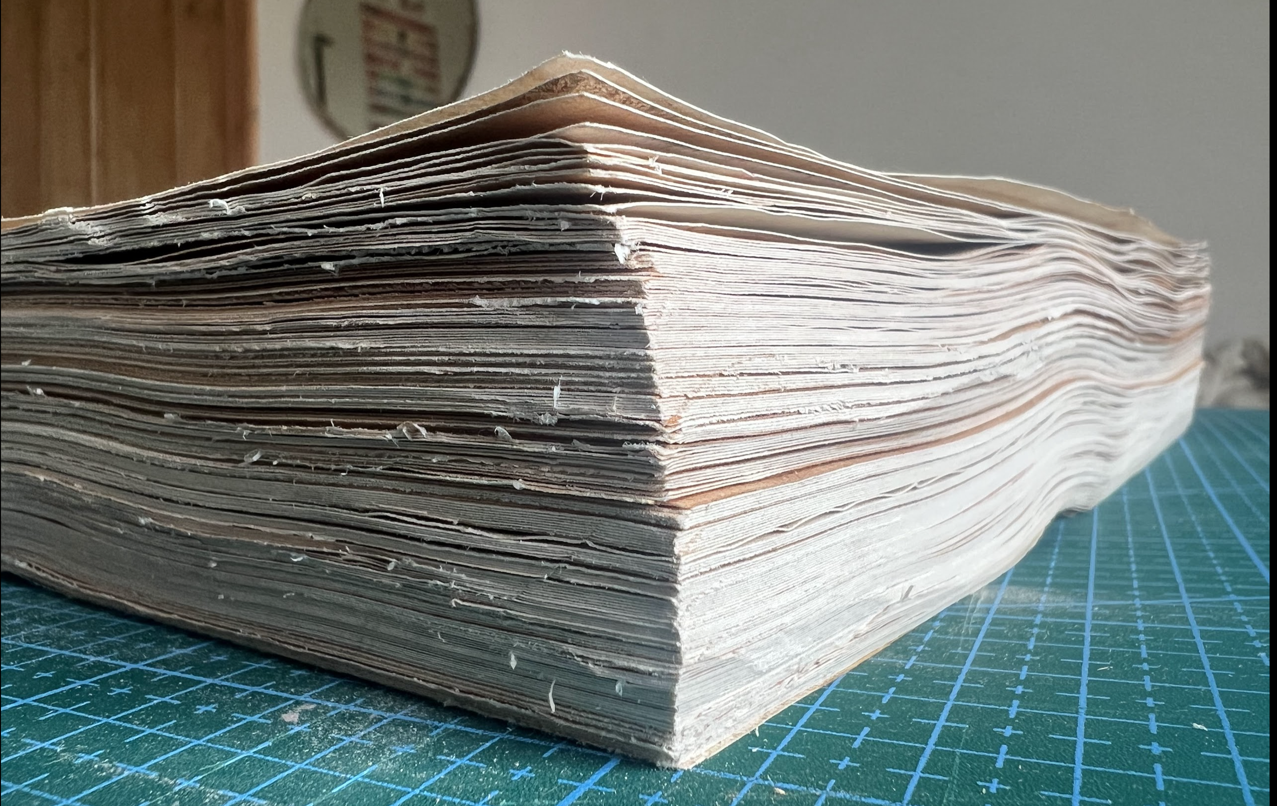

Because there were so many sheets (four to a section, and roughly 20 sections? i cant rememeber) to create the holes I made a cardboard stencil that I would fit to the top so the top edge would all be in line and the bottom (which had more leway for removal) could be cut smooth once bound.
I used a metalic thread to bind the sections as I wanted it to fit in with the colour scheme of the cover, and red felt too distracting. Cutting the sides down to size was not an easy process. My book was so god damned thicc that it came out a little uneven, but I think that adds a little more character and more on a kida ye olde feeling. To finish it I painted the cut edges a darker colour than the tone of the paper, to give the impression of a well handled book that has been dirtied by time.
Hardcover


For the cover, I initially just did the basic hardback design with library corners ect. Once it was done I decided it was too bright for an aged book and stained it darker with my leftover paper staining mix. Next I realised I had one lock spare from the satchel and had an idea! Whilst it is not apart of the canon design, I decided to add the lock to the book to really signify that the viewer is not meant to be reading this book. As you can see by the side profile of the lock, I had to create seperate covered boards to ensure both lock elements were positioned correctly.


After the staining had dried, it was time to design and paint the pattern on the book. In all of the refernce photos it is not completely clear what is exactly the cases design, however I did see some elements of baroque floral patterns and baroque/art nouveau ironwork-esc elements. So I had a snoop on google and compiled lots of elements from lots of patterns to create my own.


After I had created the pattern, I watered down some gold paint and drew on the pattern onto the cover with pencil. While I tried to be as symmetrical as possible, it was mildly impossible so it is a little mis-shapen in areas, but it is not too noticeable. While the middle sections of the front and back are evidently different from eachother, the side elements are also not exactly the same. I deliberatly made the front designs miss a couple elements while keeping everything else the same. This is to create a subtle sense of discomfort that isnt immediatly recognisable to the viewer, another hint that maybe, you shouldn’t read or open this book. Annoyingly I didn’t take any pictures of this but I still had some remaining metal corners for the case, so I added them onto the book to add some interesting textural/surface elements.
The Timelines
In the events of Drakengard 3 we see Accord document the active timelines through loose sheets that she adds to by hand.


I want to keep roughly the same format/design, but add in for detail and information of the game and its events. Again I will need to look into other sources of archival technices and record keeping to inspire and create the format I will use for these loose sheets. Also the numbering systems Accord is heard and seen using, EID_MD0000… ect, while sequential, are absolute bullshit. They don’t stand for anything, can’t be trasnlated into hexadecimal and made sense of, don’t refer to dates in an understandable way or any such similar ideas. While I believe that this is intentional, Accord is a being who we don’t know the creators of, her bosses, systems and motives are all a mystery, it would make sense that they use a different system that cannot be understood by anybody but them. But if I am to not go ABSOLUTELY FUCKING INSANE whilst mapping out events, I am going to have to make a new system that looks kinda like Accords, but… actually makes sense to me.


I ended up going with a small report card format, inspired by the car boot sales I had been visiting throughout the course of the project. I also created a little tine stencil so my handwriting wouldn’t go all wonky. I wanted to hand write these instead of typing as they are meant to be field notes, created as Accord watches history be made, not yet official or boilded down to their most important componants, still rough around the edges. In terms of size, I decided to keep them the same size on the tin that would be included in the case as to not imply that they were less important by making them smaller than the tin, shape hierarchy and all that shit.
The content of the notes are of course the events of Nier Replicant. Because I don’t have a windows computer at the moment I had to watch a playthough of the game and make notes through that. I used this playlist: https://www.youtube.com/watch?v=7LfunaDo8ms&list=PL4vbGURud_HpNP24aIecIqh87O2zPSO05 by a creator I’ve watched before. They are good at cutting out the fat of gameplay whilst ensuring to keep important dialoge/the entire story. For the numbering system of the sheets I kept the EID (Event IDentifier) of Accords previous labels. For the first two numbers of the sequence referred to what part of the playthough videos the notes were taken during (it is meant to be ‘nonsensical’ in a sense that only the creator really knows what it is referring to, the viewer just kinda has to accept that it referrs to something and that they are never going to understand what it represents). The next four numbers are the year which the events of the notes take place, this was so I could actually keep track of what I was writing. The final two numbers refer to what branching path is being talked about. 00 is the events that lead up to the branches. 01 is branch A, 02 is branch B and continues until 05 branch E.
Extra Content
ITS A CHRISTMAS MIRICAL IVE BEEN SO ON TOP OF EVERYTHING THAT I CAN MOVE ONTO THE EXTRA STUFF LETS GOOOOOOOOOOOOOOOOOOOOOOO!!!
Accords Toolkit/Tin


Accord’s tin is mostly comprised of car boot sale items, buttons I’ve temporarily stolen from my mother and a couple bought items. The writing kit has an old whiskey bottle repurposed to hold ink, a dip pen of mine and her glasses (which i made by buying a pair from tiger, cutting the top half off, and then spray painting silver). Accord is an android and so to hint at this, instead of a med kit, she has a repair kit! All of the items here are from several trips to the car boot sale (the oil can is my personal favourite). Next is her map kit, consisting of a compass with switchable elements, scissors, tweasers and the best thing ever, a tiny rolling distance measuring device. My mother has told me she will steal it from me once I get it back from handin lmao. Finally are Accord’s trinkets. I wanted to imply that in sometimes, maybe she isn’t the most serious and likes to keep shiny things from humans.
And whilst it isn’t in the tin, I have also included a thrifted camera to further push the recorder/observer hints for the viewer.
Character Sheets & Map
Next on my stretch goals was to create little illustrated character sheets for the characters that pop up most often in game, kept in Accord’s case so she knows who she is looking for/at. I was having trouble trying the draw them traditionally straight onto the paper sheets, so I drew them digitally and then traced them.

Really REALLY annoyingly, I ran out of time and had to scrap the Devola and Popola sheet (the two on the far left). Drawing Yonah, Emils two forms, Kaine and Nier just took too much time, but I did get them done! On the back of the sheets I just put a few character info elements from the fan translated Grimoire Noir book!


The numbering on these sheets EID_CIDS_(number) breaks down into EventIDentifier_CharacterIDenificationSheet_(character number in terms of story importance)
The map was a little tricky to stitch together as you never get an overall map for the game area, you just get little maps that detail the areas you can explore. So I had to take these:

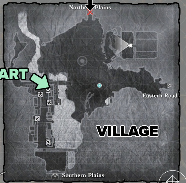


And stitch them into this:


I inked the lines and added shading to the water and place names, and the map was done!
Gloves and Tie
ALL HAIL MY SAINT OF A MOTHER
so I had been visiting allllll kinds of shops to try get my hands on a set of gloves and a tie for Accord, but after a month of nothing fitting *le vibe* I ended up buying my own fabric and trying to make my own set of gloves.
As you can see from the pictures below, my attempts didn’t exactly go well atall.


I promise I really did try but my mothers sewing skills did not osmosis to me whilst in the womb and so I failed miserably. My mum then offered to try make the gloves so I was like yeah sure why not and then the dUnHaM fAmiLY StuBboRNneSs kicked in. My mother then tries to make these gloves like four fucking times, eventually has to abandon the fabric I chose, and then rocks up to my dorm 8pm day before hand in with these beautiful little bubs:

I had to choose the broaches of course but eveything else was my mother so please give her a round of applause cause the gloves and tie really makes its feel like this is a toolkit for a workday in Accord’s life.